


With contemporary art, it’s not always obvious what year a piece was created. Sometimes, art from last year and from a few decades ago are indistinguishable from each other in age or in influence. But in the three new exhibitions at the Museum of Contemporary Art Denver (MCA), timing is everything.
On the main level, a Keith Haring premiere takes us back to the 1980s in Manhattan, where a new street culture was burgeoning from the multicultural melting pot of the Lower East Side. In a first-of-its-kind exhibition, 13 panels that were excavated from the Grace House Catholic youth center and auctioned to a private buyer are now in Denver and on view.
The lower level has been transformed by Denver-based artist Jaime Carrejo, who is responding to the pandemic while looking ahead at what will come next. His use of layered Southwestern imagery, domestic objects and sensory inputs encourages introspection while reminding us of the strange times we are living through.
Topping it off is a second-level group exhibition called Colorado in the Present Tense. Four Colorado-based artists present new and reframed older works that speak to our current reality, from the sudden awakening related to Black Lives Matter, to the regularity of protests and activism, to the widespread grief of isolation and sickness. Narkita Gold’s Black in Denver features 100 portraits of those who identify as Black and living in Denver. Rick Griffith showcases his design ideologies and emphasizes the marriage of art and activism. Maia Ruth Lee’s pieces use symbols in the place of letters as a way of dissecting the failure of language in expressing emotions. And composer Nathan Hall focuses on the “sonic arc” of 2020 with sound installations in the entrance to the museum, the hallways, the elevator and culminating in a sound garden on the rooftop terrace.
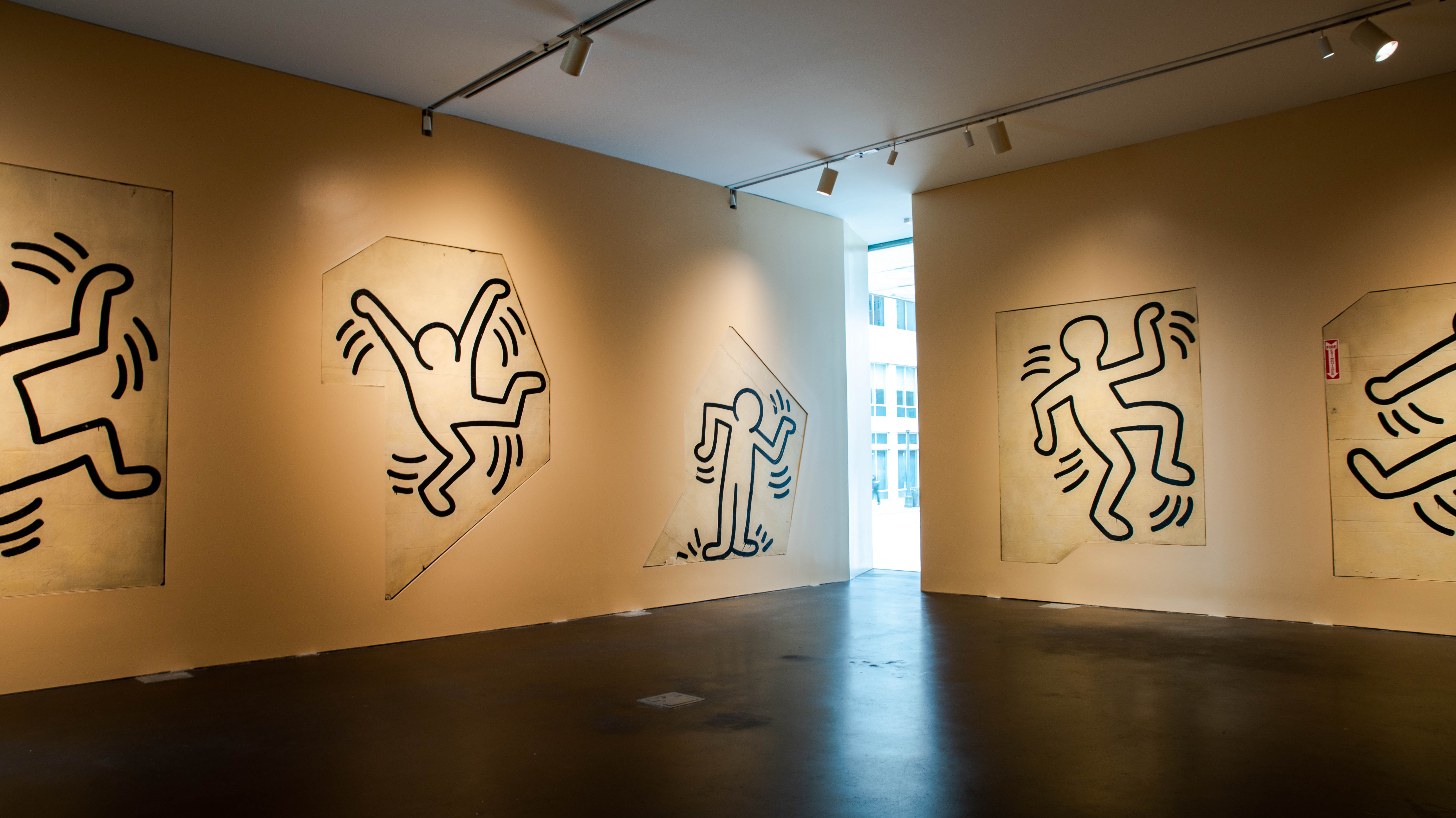
Keith Haring, Grace House Mural
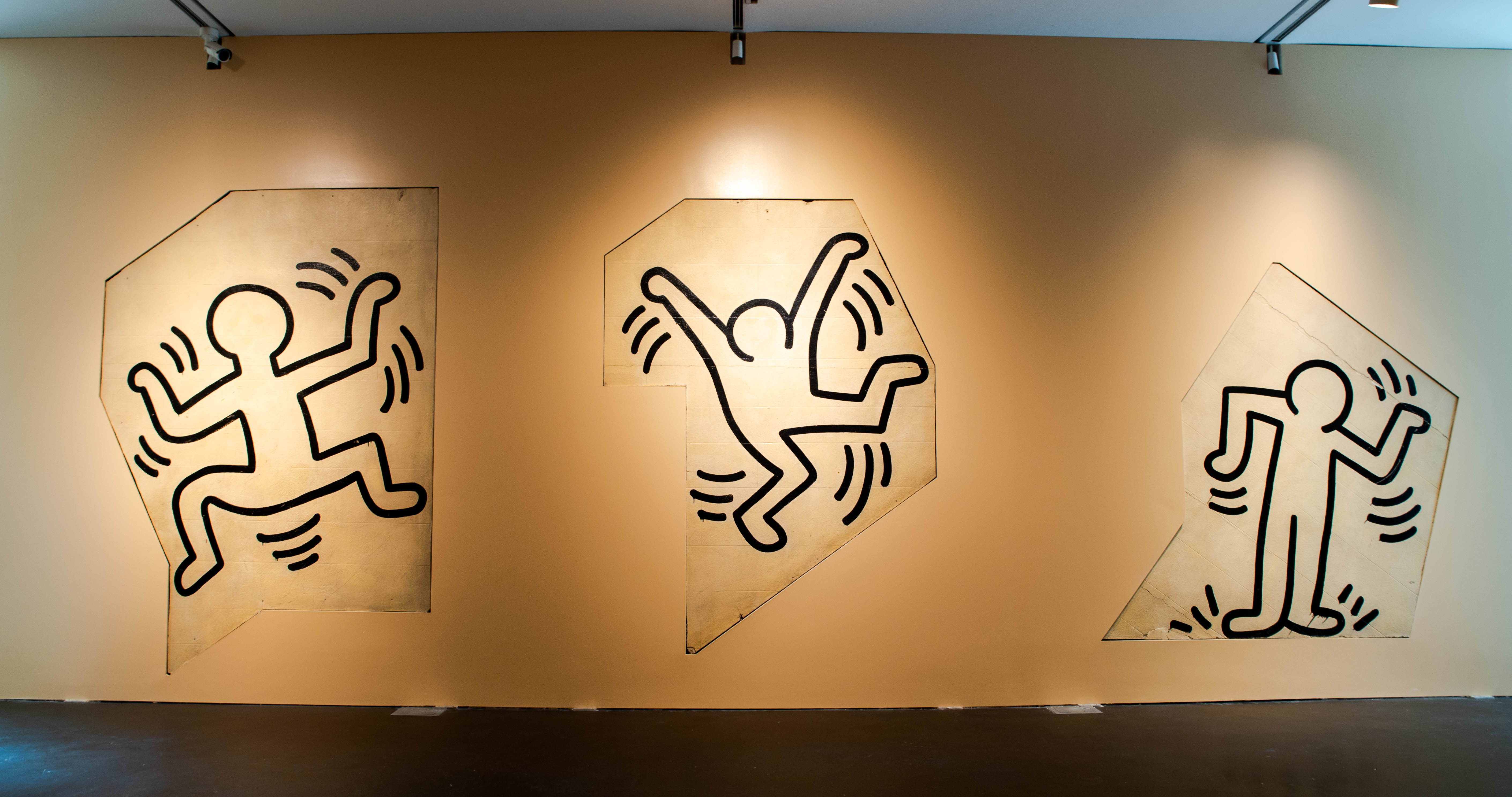
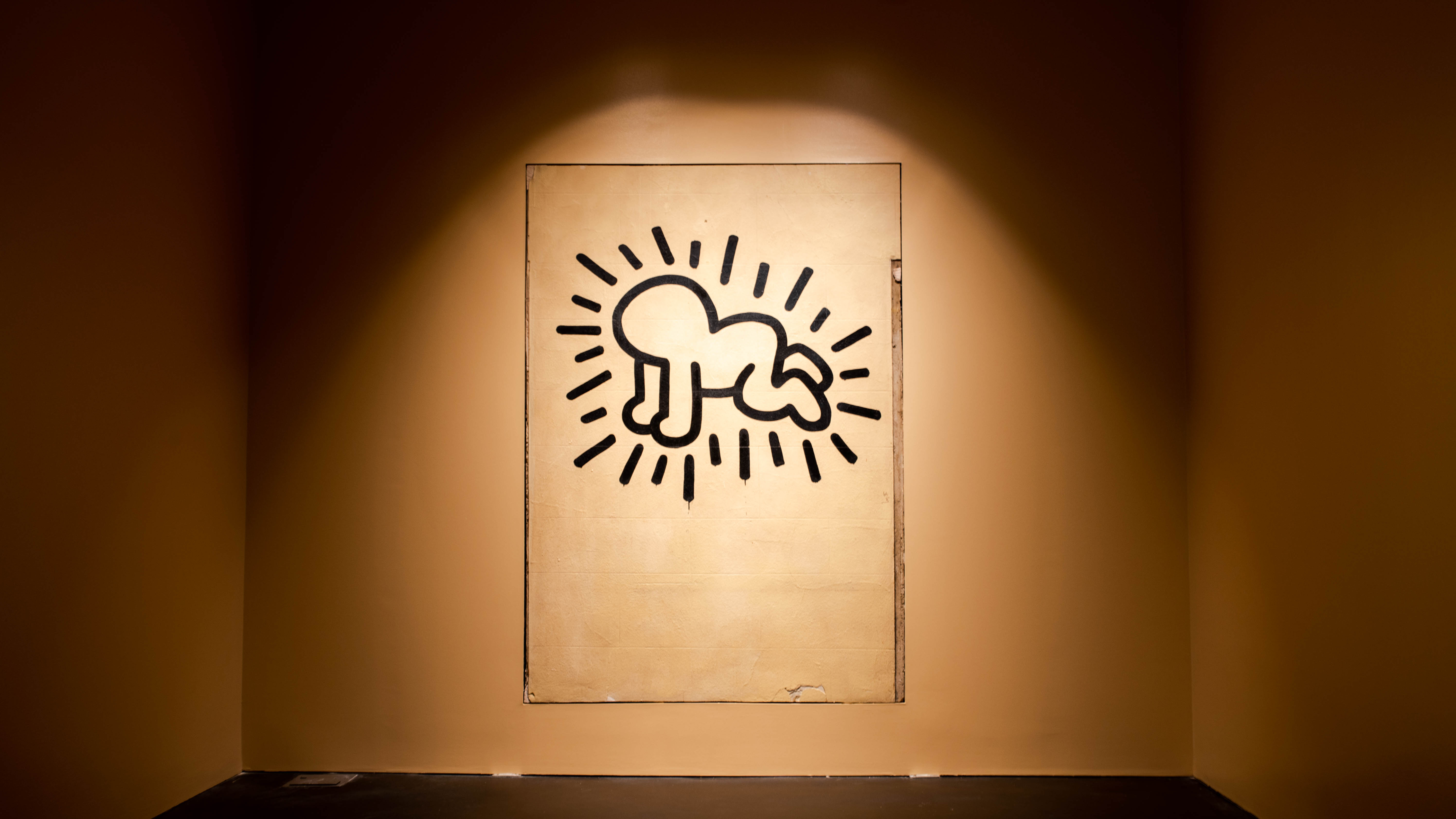
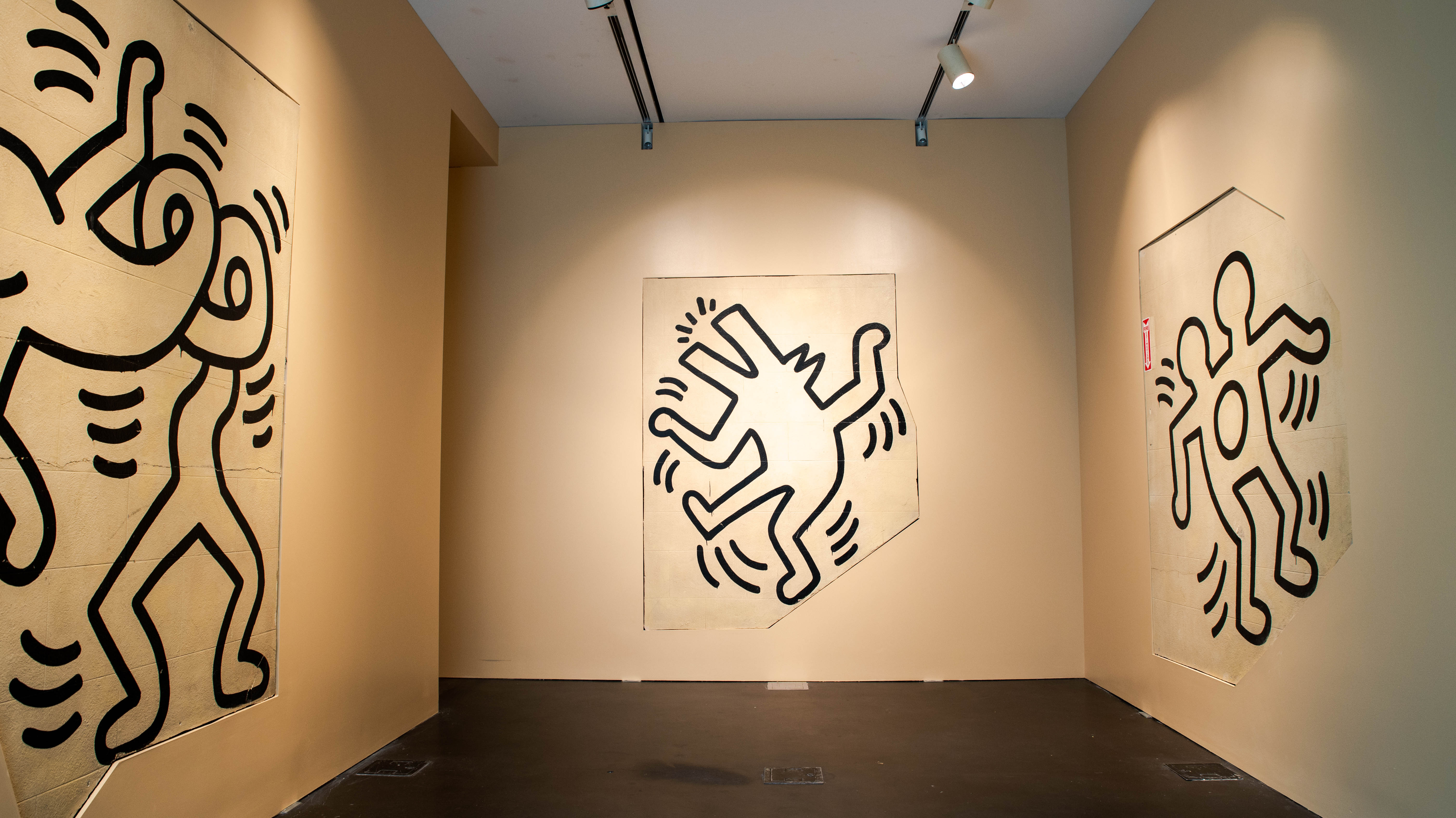
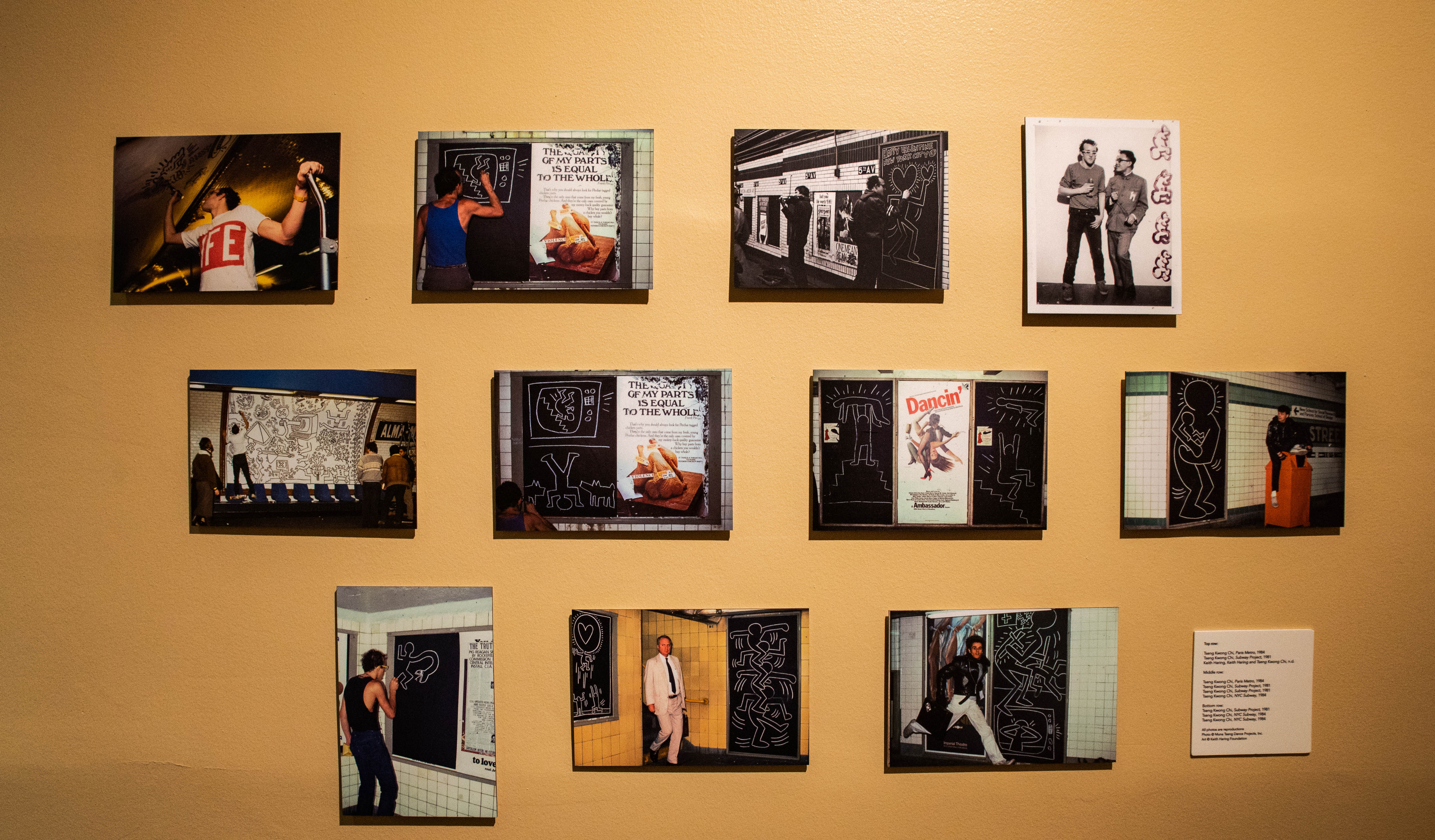
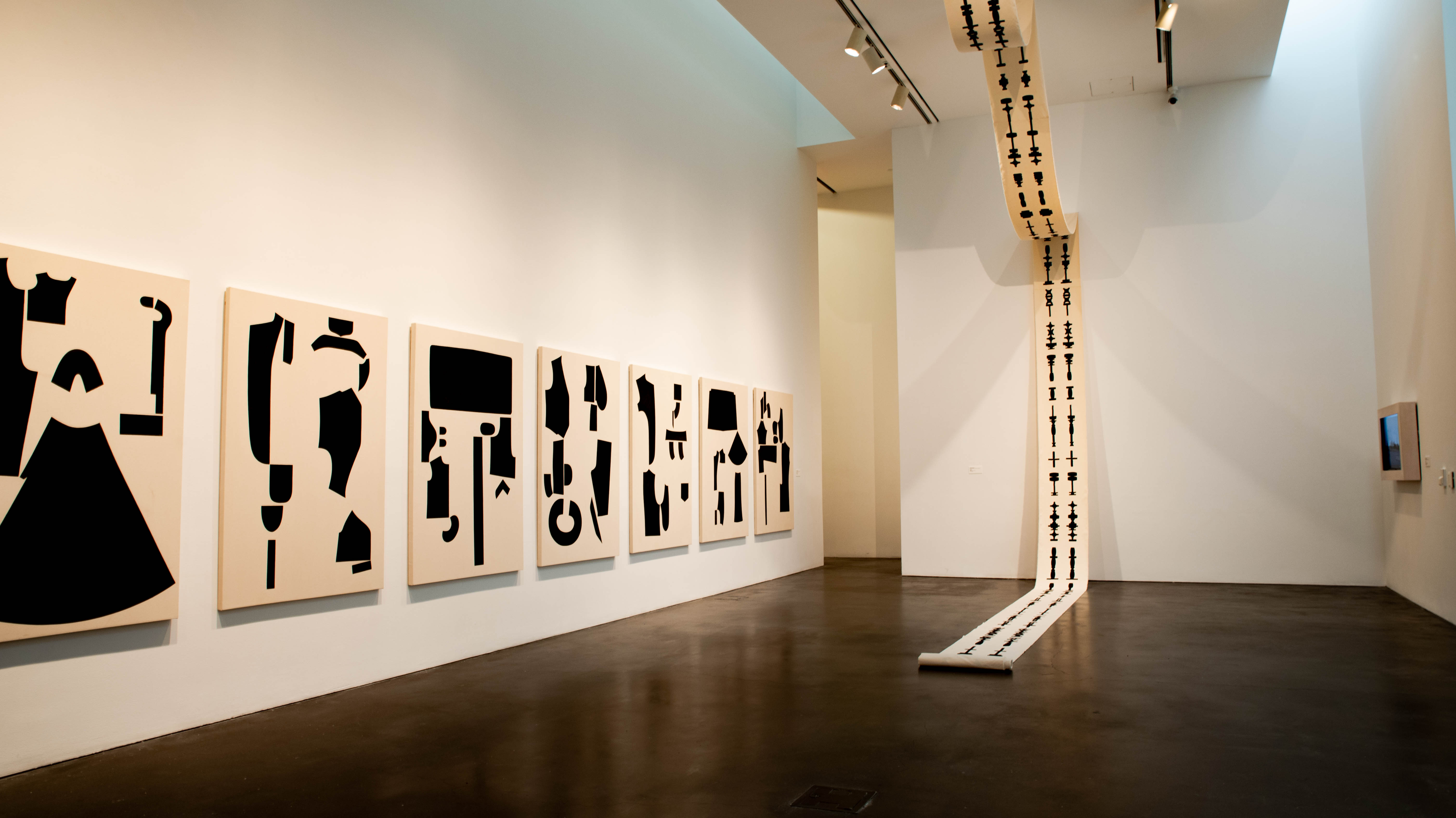
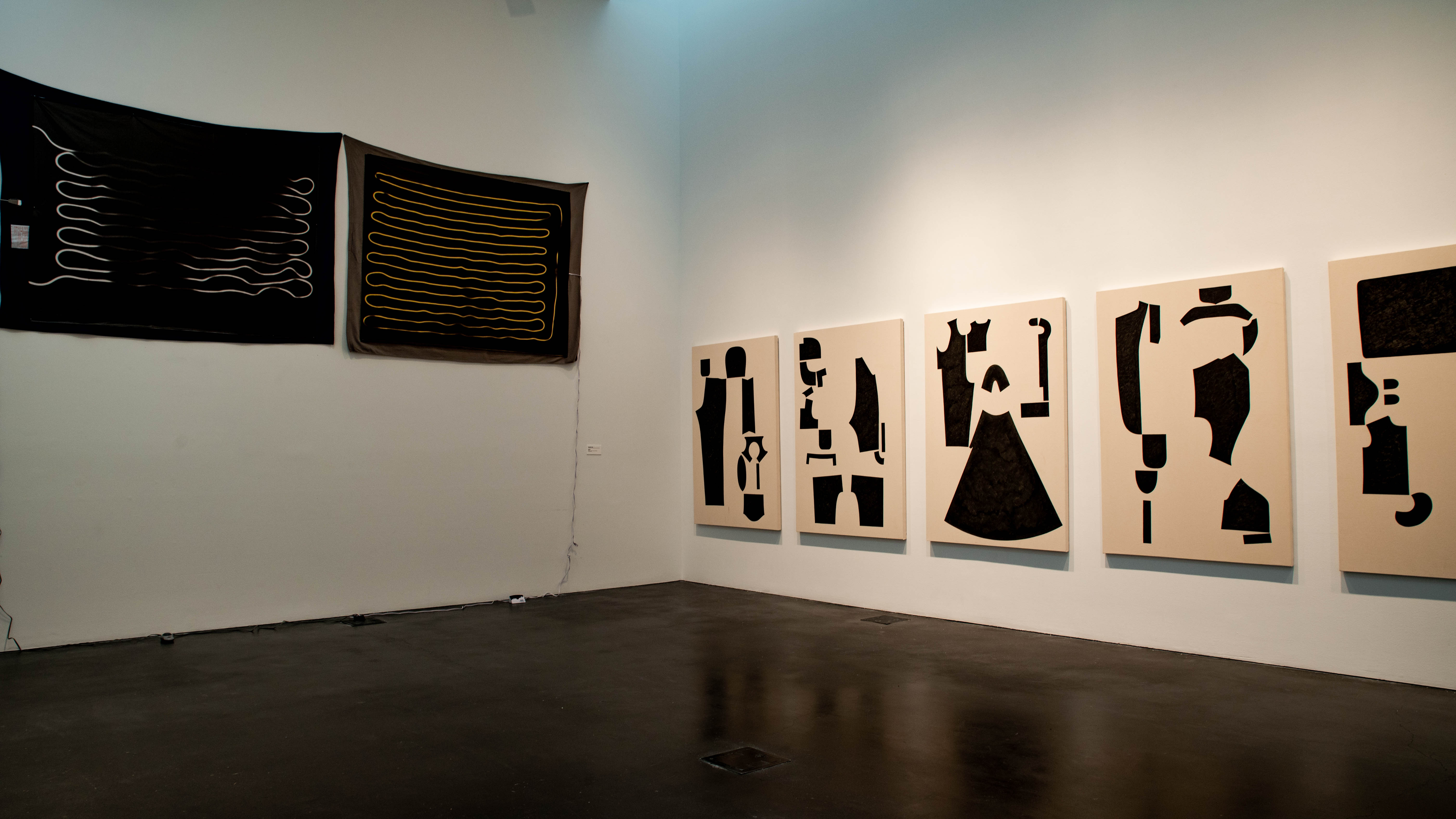
This is the first time that Haring’s Grace House Mural can be seen by the public outside the walls of its original home in a staircase in Manhattan. Painted in the early 1980s over the course of just one night, the Grace House Mural consists of 13 figures created with thick black lines. Some of the figures have become Haring’s most recognizable symbols, like radiant baby.
Much of Keith Haring’s work was created in the public domain, like in the subways and on the streets, which makes the Grace House Mural exceptional. Although he studied fine arts at various schools and was raised by a cartoonist, one of his biggest inspirations came from a 13-year-old Puerto Rican street artist named Angel Ortiz, or LA II, that he met in 1980. It was Ortiz that introduced Haring to the streets and showed him the ropes of tagging and graffiti culture, influencing his style heavily.
Around the same time, Haring frequented a dance club that some members of Grace House also went to. The story goes that one night, they befriended him and asked him to paint a mural inside the youth center. Without getting an OK from a superior, Gary Mallon (then in his 20s) approved of the decision and watched as Haring painted the figures one by one. Before the youth center closed, new members would often be amazed when they saw the staircase mural, asking if it were authentic Haring or not.
With the youth center closed and the church that owned the building facing a mounting list of repairs and improvements to the 90-year-old structure, plans were put in motion in 2019 to sell it. Fearing that any buyers would gut the building, the church arranged for the excavation and auction of the 13 Haring figures. Each figure was cut out of the wall and separated from the terra cotta backing.
In the museum, the mural is presented as separate panels, placed inside false walls that have been made to hold the 1000-pound cut-outs so they appear as part of the wall itself. The idea to make the false walls came from the exhibition manager at MCA, Nick Silici. The background color — whatever color was originally painted in the Grace House staircase plus a few decades of pollution and grime that result in a light beige — has been matched to complete the effect. That color is being somewhat affectionately called “New York Patina.” Every blemish has been left in place on the panels, from scuffs to little pieces of tagging like a “hi” underlined with a squiggle.
Instead of what most people would consider a mural, the Grace House Mural panels are something else. They’re almost sculptural. Since they were painted going up a staircase, they each have a unique shape, some with slanted bottoms, others with slanted tops. Haring used pieces of the building, like a plaque with the founder’s name and a doorway that led to an office, as integral pieces of his design. Separated from each other and from the building they were painted in, the figures appear as individual works that share a common theme and have lost some of their cohesiveness. But, they also represent the time and place that Haring painted them in — a characteristic that makes them more valuable as historical items than contemporary art collectibles.
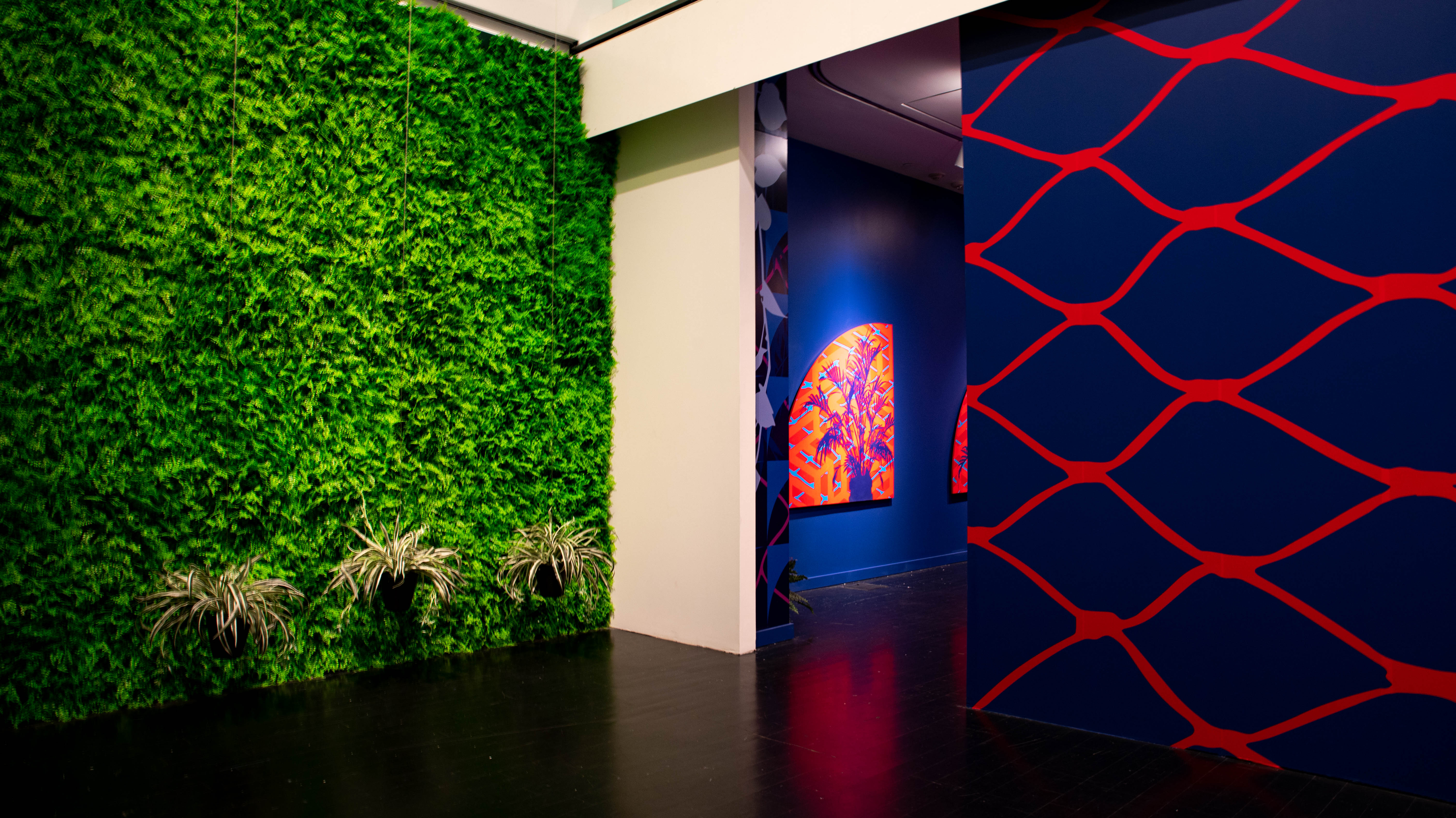
Jaime Carrejo, Waiting
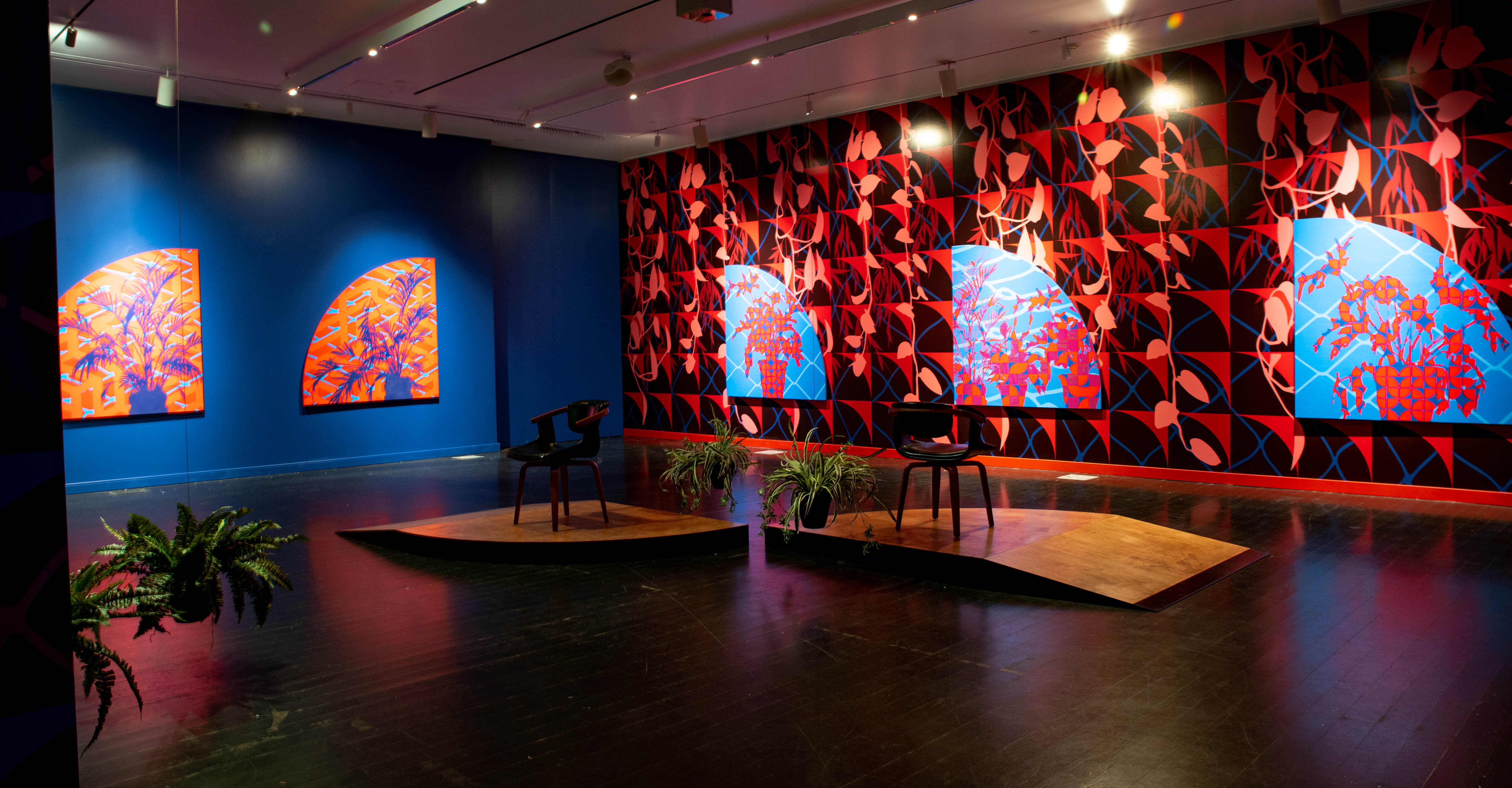
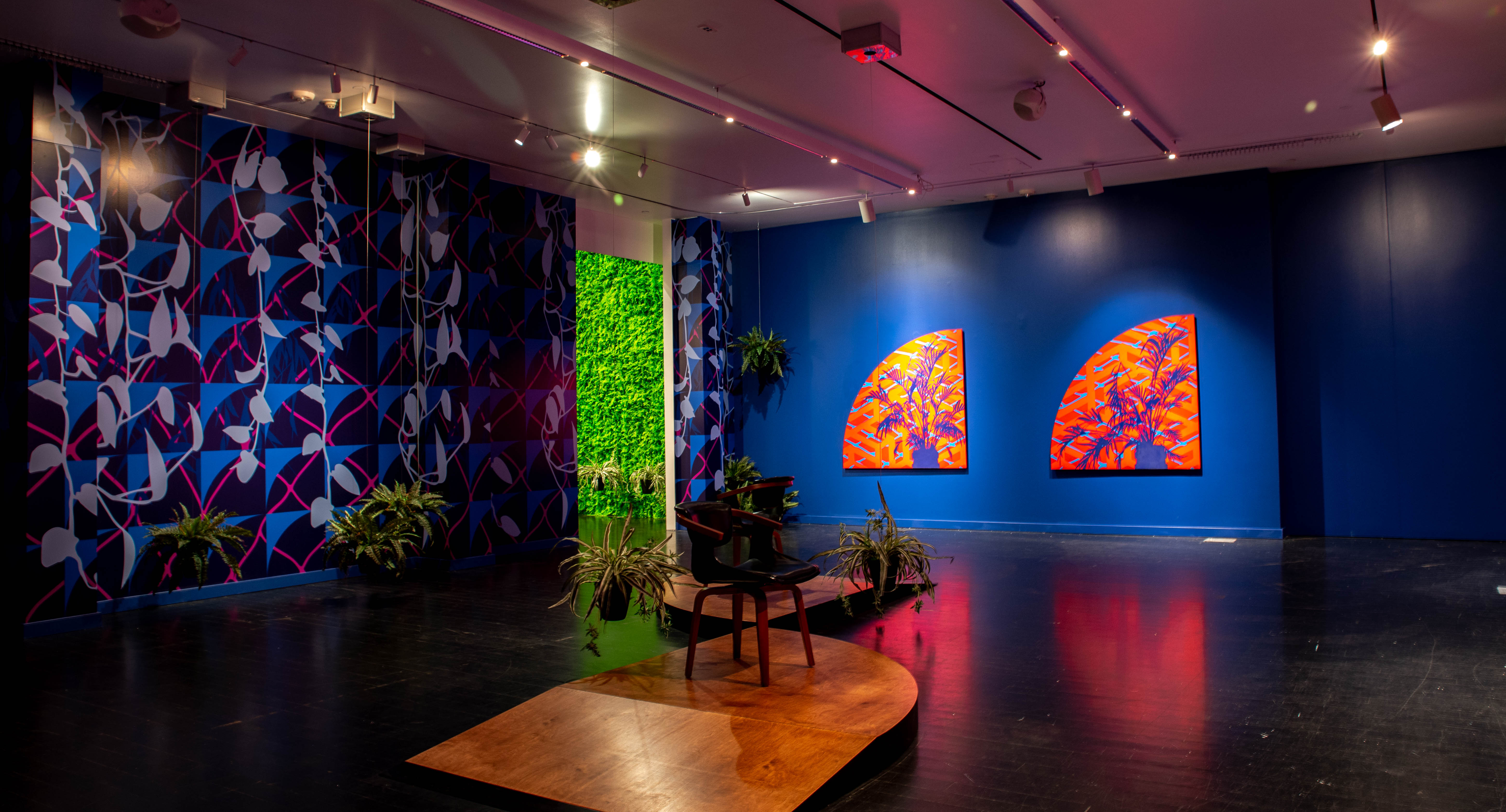
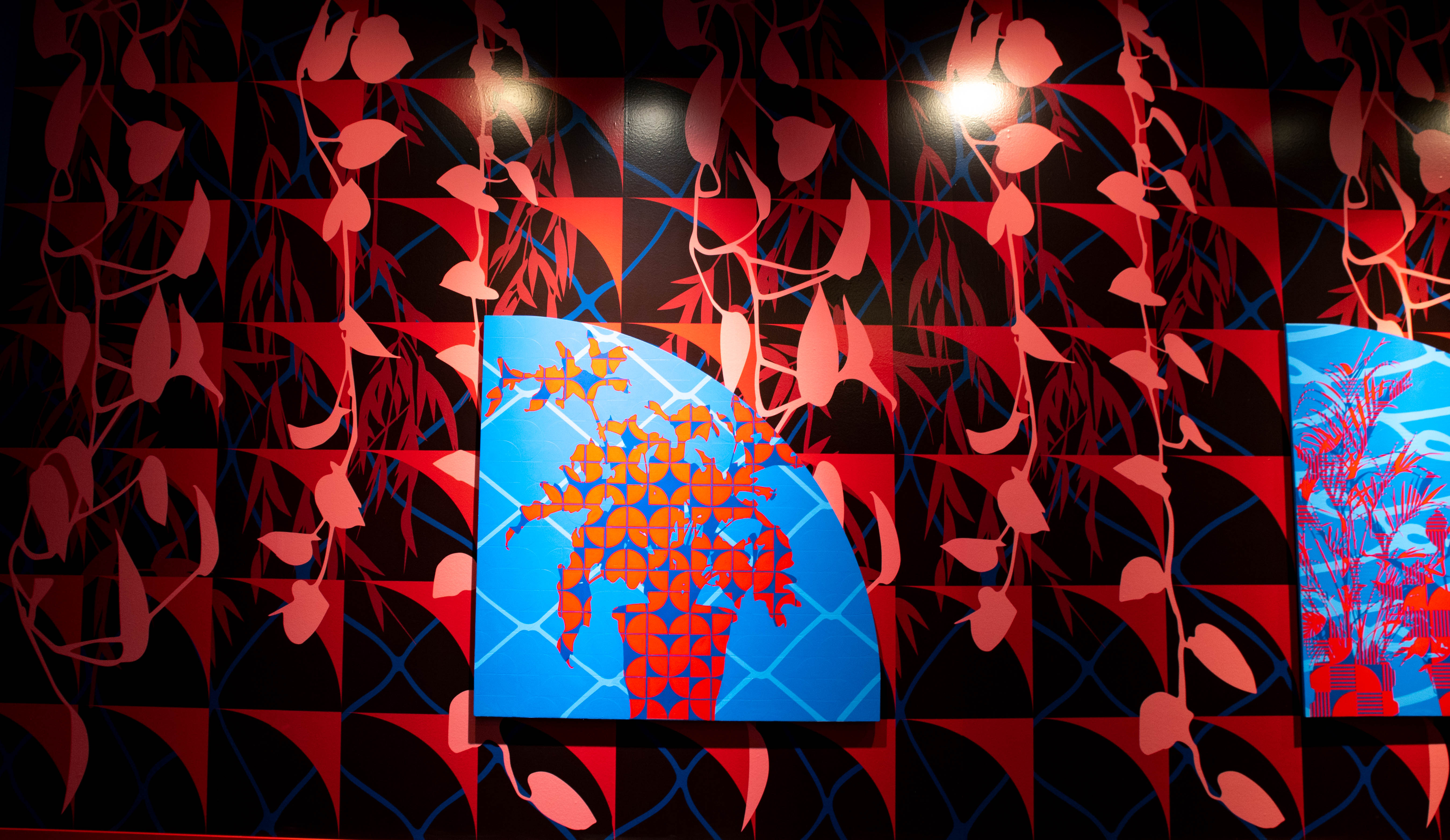
Maybe it’s been more than a year since you sat in a waiting room, but in this exhibition, you’ll be reminded that waiting rooms aren’t always for appointments at offices. Sometimes, the place you wait is in your head, or in limbo between places, or maybe in your own home.
When the COVID-19 pandemic led to stay-at-home orders in Denver, artist Jaime Carrejo started thinking about the experience of being shuttered inside. He wanted to explore the power of barriers, whether that be physical or psychological, that came as a result of those orders. Waiting presents such a space — it is both inviting and confining, representing the conflicting experiences of quarantine.
The juxtaposition of textures, use of contrasting colors, moving plants and distorted elevator music creates this friction in the room. But you won’t notice all of these things at once. Instead, the plants move infrequently and slowly, changing behind your back. The music only twists out of tune just as you forget you’re listening to it. Layers of colors divert your attention from one part of the wall to another but offer no substantial horizon or main subject to focus on. It takes time to familiarize yourself with the room, but once you do, it doesn’t feel satisfactory.
Using pieces of his own domestic space, Carrejo opens up a small window into his own experience during the stay-at-home orders. It’s not enough to say that Waiting is autobiographical, it’s only enough to remind us that it is a space of introspection and strained comfort.
Unlike other waiting rooms, there aren’t many places to sit here. Only two chairs rest on raised platforms in the middle of the room, facing opposite directions. When the plants move (attached to wires and pulleys in the ceiling panels), it encourages you to move too, shifting from one spot to the next. This constant state of mobility is limited, yet it provides a new view of the room with each transition. By doing this, Carrejo reminds us to adapt to our circumstances. He asks us to look ahead at what comes next, after all the waiting from the past year.
Colorado In the Present Tense
Narkita Gold, Black in Denver
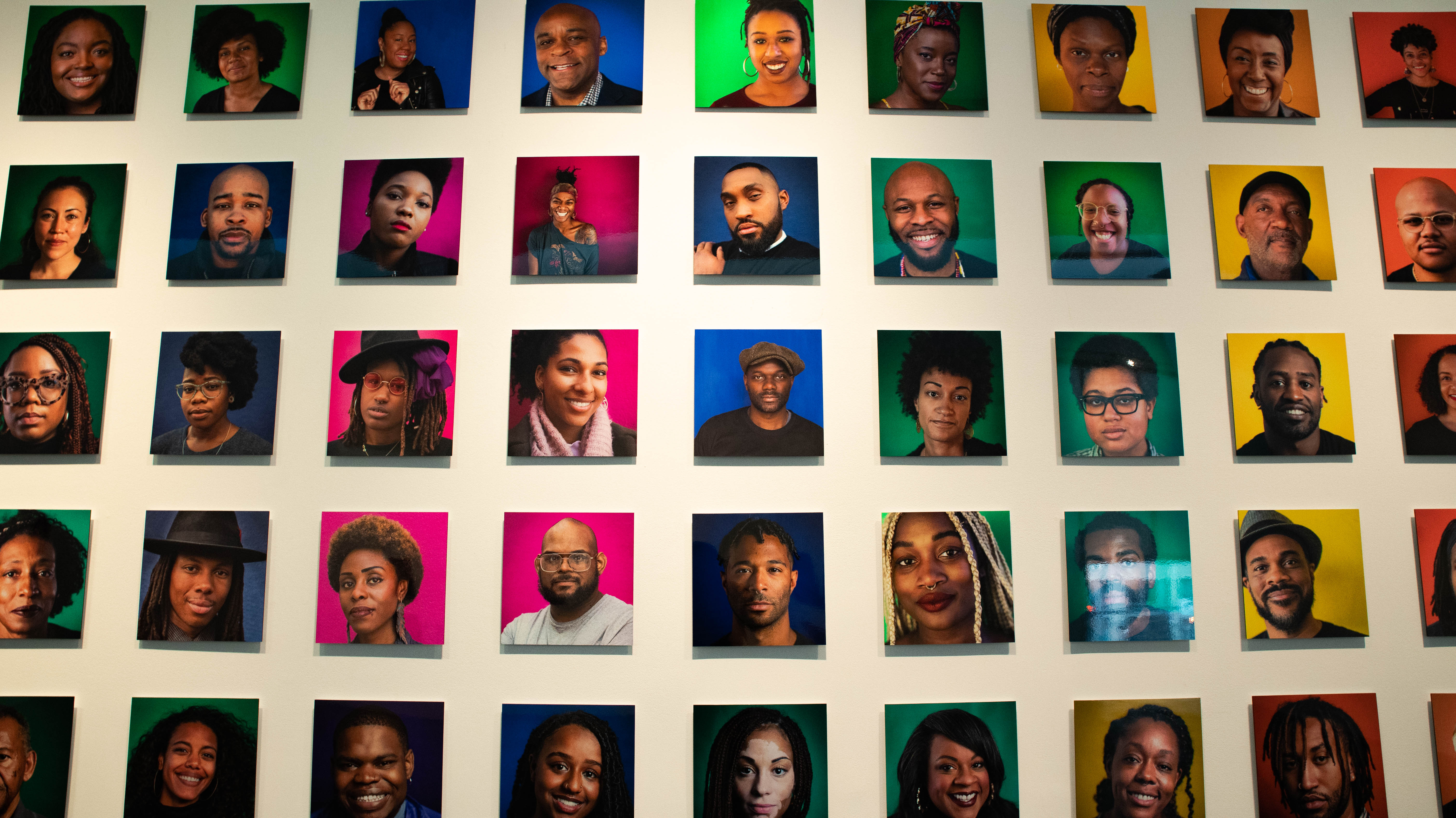
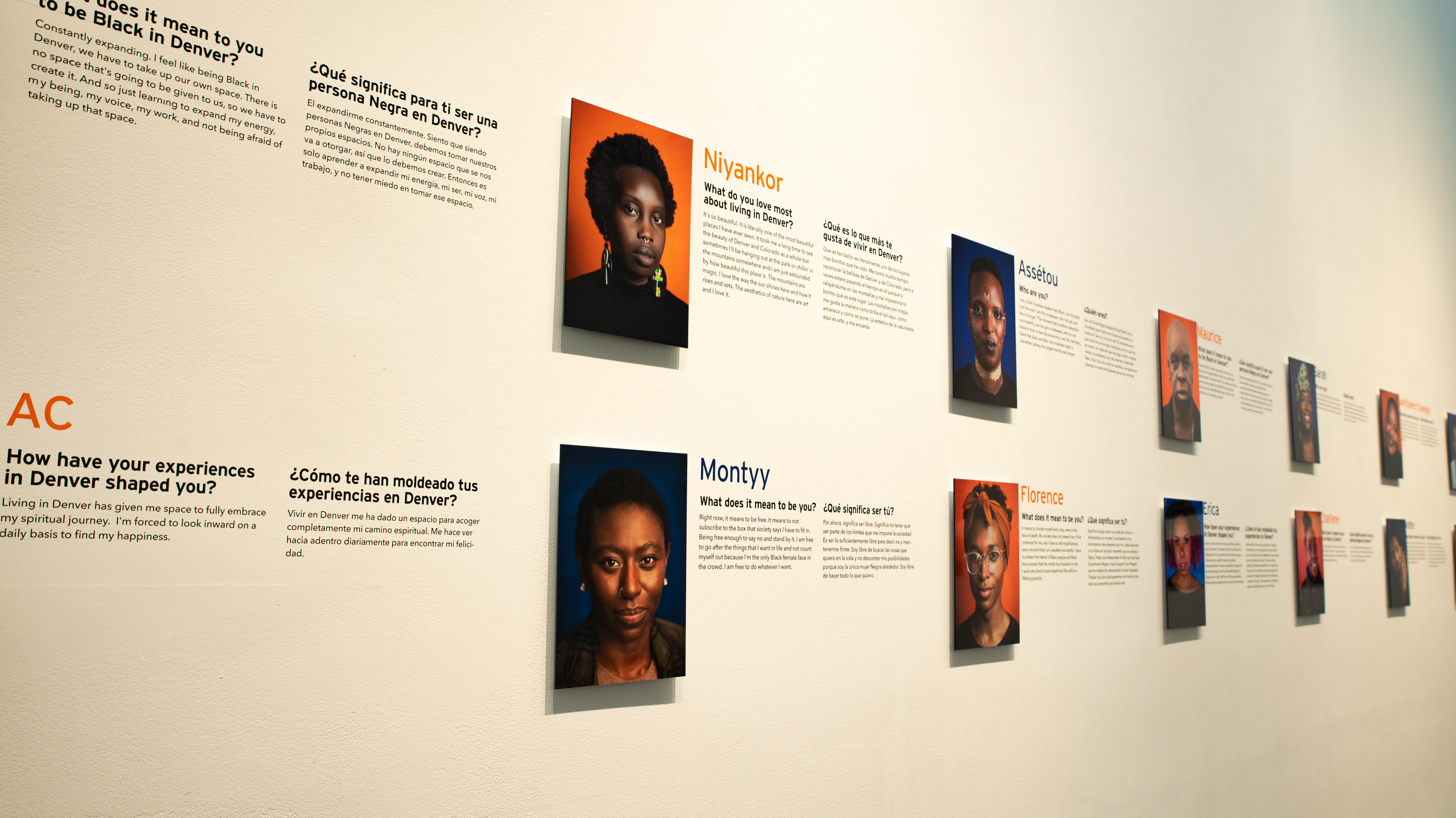
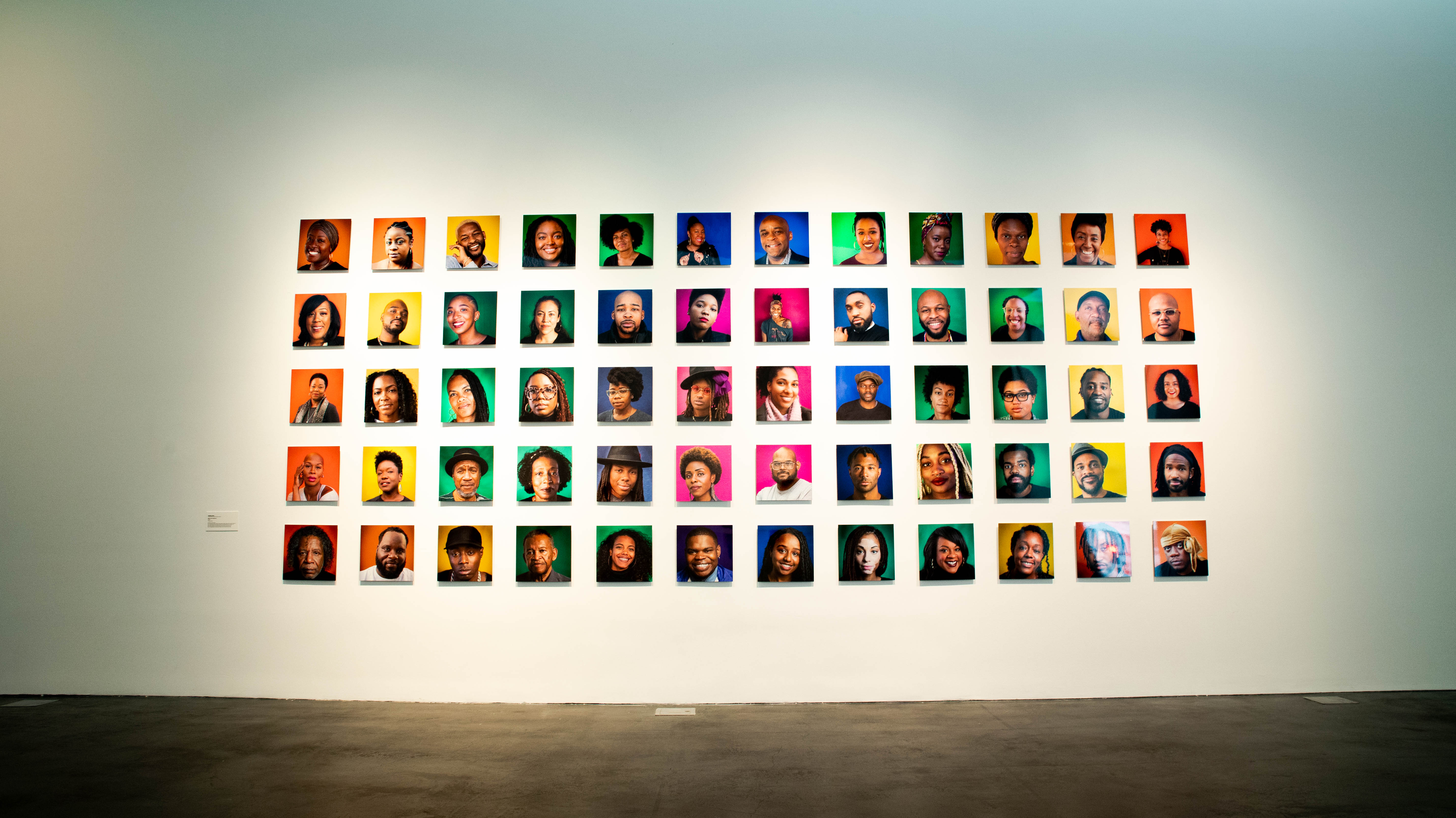
“What does it mean to you to be Black in Denver?” Narkita Gold asks this, and other questions about the Black experience in Denver, to 100 locals who are pictured in bright portraits in this exhibition at the MCA.
The project started in 2018 for Gold, who wanted to create something that showcased the beauty and complexity of the Black community in Denver. In an interview with us last year, Gold said that one of her primary goals is to “show that all Black lives matter: not just cis-gendered, not only Christian, not just gender-conforming folks, not only people with a lighter hue, not just the classically beautiful or the coolest ones, and not just successful Black people.” Her intention is to have an ongoing conversation within the community, portraying people from all backgrounds in order to bolster their interconnectedness.
This richly detailed network of individuals who each have their own unique experience and persona adds up to the collective whole of being Black in Denver. In the exhibition, this is portrayed on one wall as a quilt, with dozens of portraits lined up in a large rectangle. Each portrait is crisply in focus, featuring only the head or torso against a saccharine-colored background. On other walls, the interview questions between Gold and her subjects are featured next to the portrait, giving an even more detailed and vibrant idea of who the Black community is in Denver.
Overall, there’s a genuine sense of authenticity in the portraits and their answers. Gold’s questions are responded to thoughtfully, sometimes even poetically, offering more than a surface-level understanding of each person’s identity. They are candid, funny, provocative and compassionate. They are a reminder that being Black in Denver is not a singular identity, but a mosaic made up of thousands of identities.
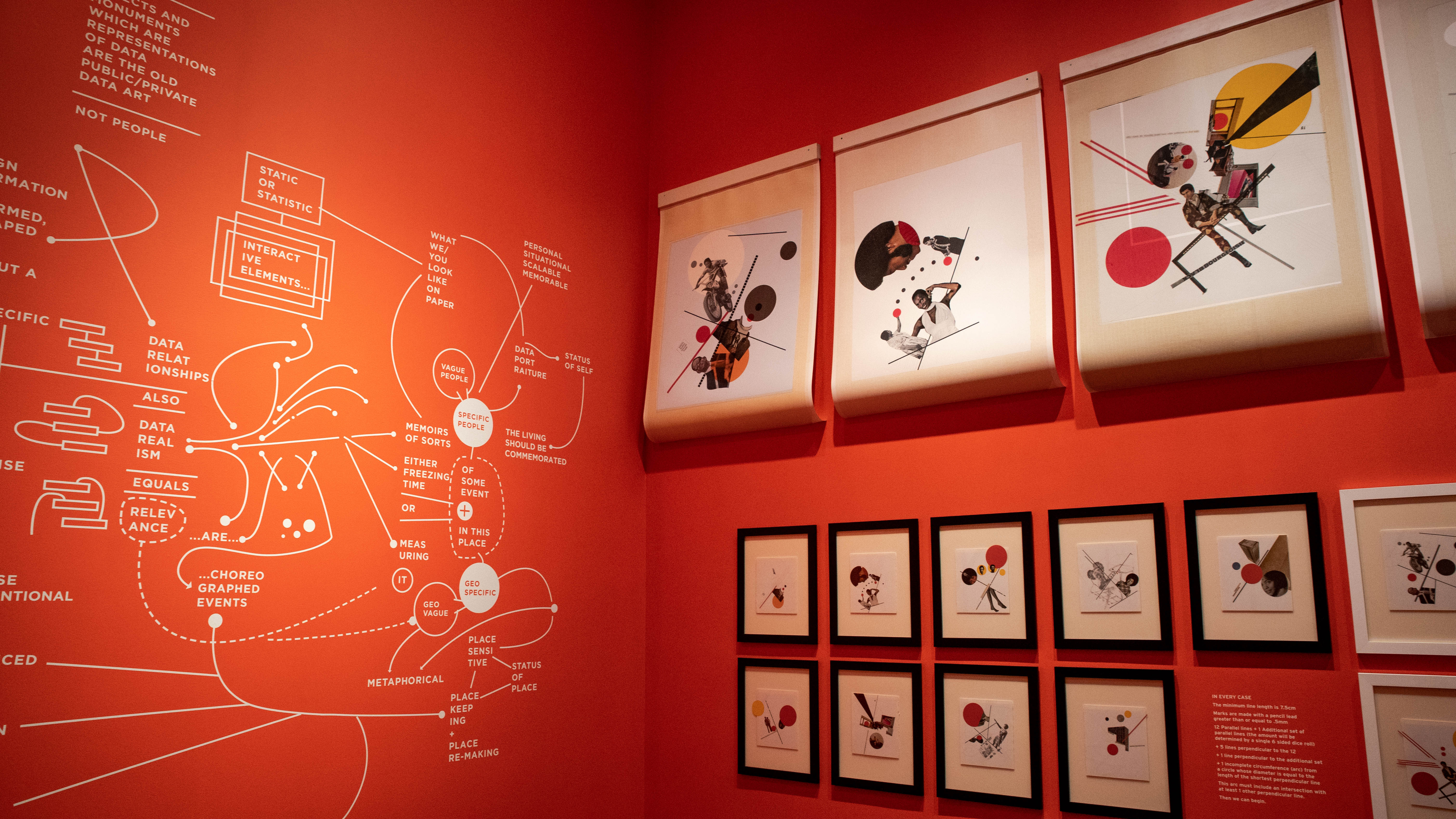
Rick Griffith, Tools
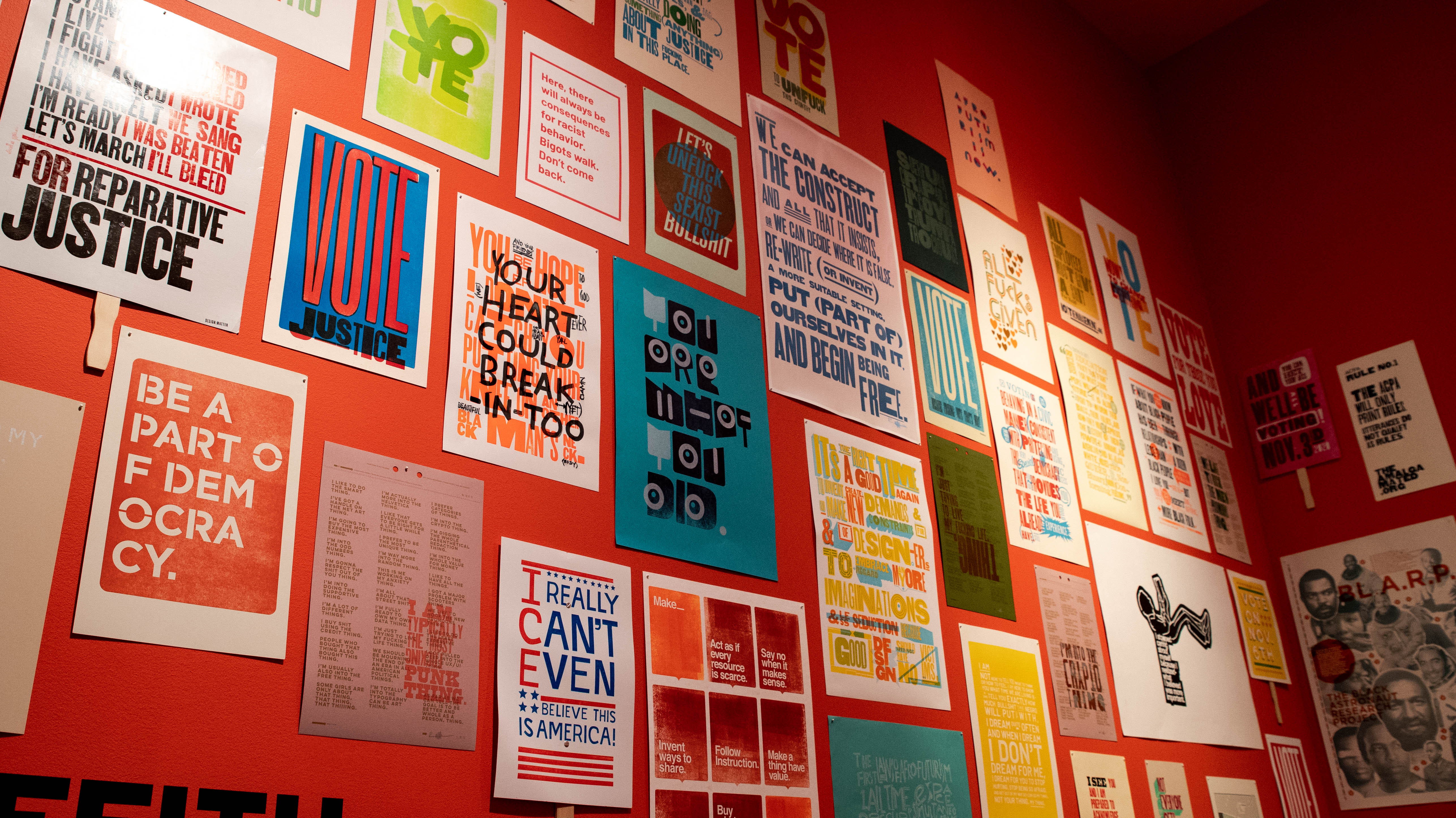
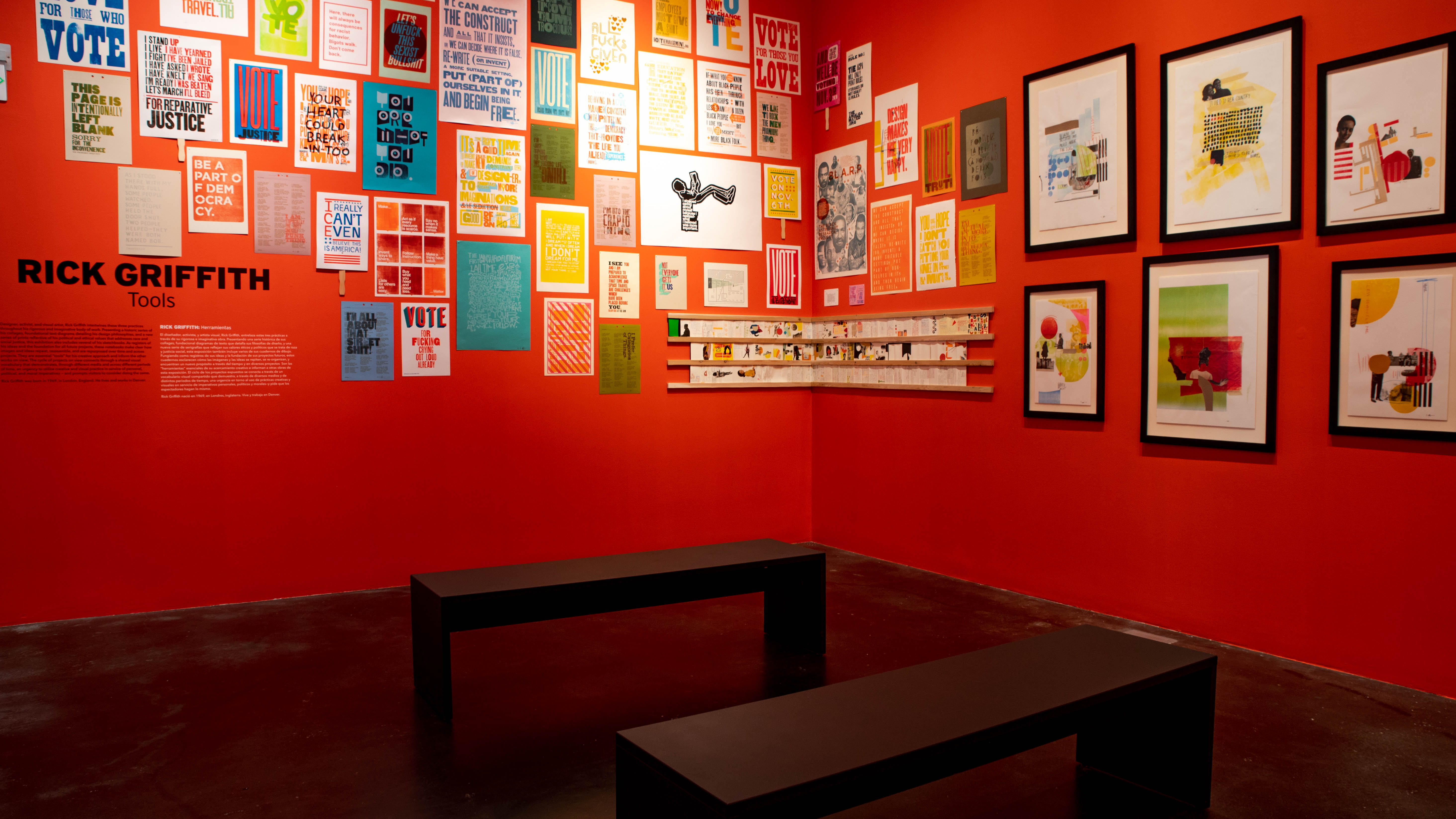
Graphic design and letterpress master Rick Griffith’s exhibition explodes with a vibrant and colorful style, while offering advice to visitors about design ideologies. Griffith is a designer, an activist and an artist, three avenues he smashes together in an epic quest to “help the good guys win.”
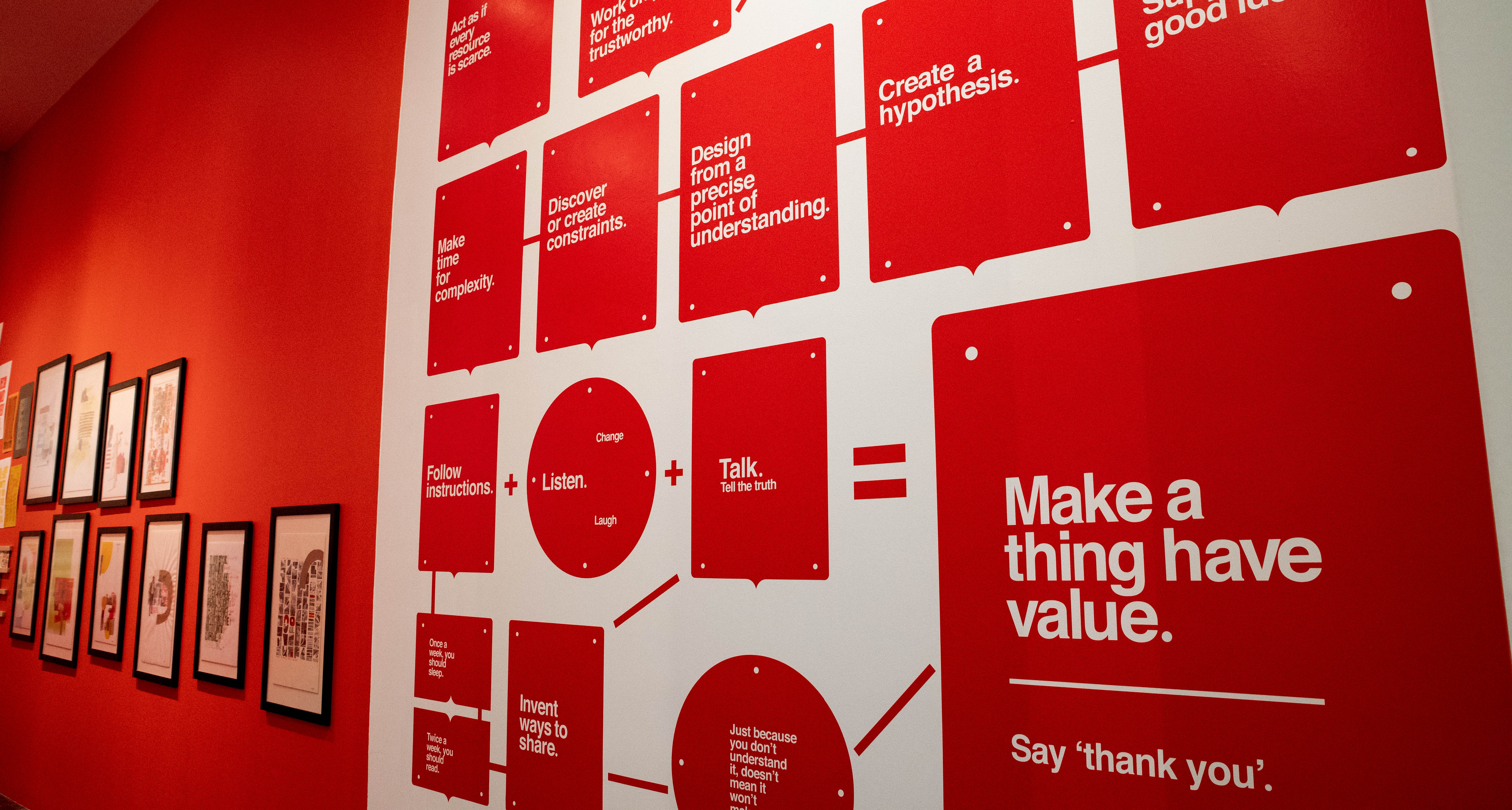
In Tools, Griffith showcases new letterpress prints that reflect his personal political and ethical values, previews of his sketchbooks, collages he’s made in the past and floor-to-ceiling design schematics. If there was ever an exhibition at the MCA that embodied an artist’s personality, this is it.
Griffith’s design ideologies are the centerpiece of the exhibition. Rendered in a maraschino cherry red and bright white, these diagrams made of text and symbols explain the choices that Griffith makes when creating something. It’s worth reading through the ideologies and then looking over the rest of the work, searching for applications of the advice.
The combination of art and activism — or artivism — is what is timely for this moment. On one wall, the letterpress prints hang gallery-style, offering a broad-strokes view of the causes Griffith fights for. Some have handles attached as if they should be carried at a protest. Others look more like something you’d see at a corporate office, although the content is anything but corporate.
In all of his work, Griffith is meticulous and calculated, making specific choices that lead to visual clues for the viewer to pick up on. Everything in this exhibition shares something with everything else because of Griffith’s loyalty to his own design practice. If you look closely, you’ll see where all the dots connect.
Maia Ruth Lee The Language of Grief
Even though humans use language to communicate with each other, there are limits to its success. Maia Ruth Lee explores the failure of language, especially in the translation of emotions, in her new work created after she moved to Colorado in the spring of 2020.
The Language of Grief uses asemic writing — or freeform writing that is understood as a language but isn’t understandable. Where most asemic writing may be meaningless, the point of Lee’s creations is to embody emotions too strong for words to portray. She wants the events of the past year to have a more profound expressive modality than content-driven language offers.
This is apparent in a series of white canvases with black symbols. Some shapes are familiar, although none are familiar enough to read. Instead, you have to feel for their intent. What do the shapes remind you of? It’s like listening to the tone of someone’s voice.
Lee’s choice to express herself through nonsensical writing is relatable because everyone has felt misunderstood at some point in their life. Words may not do a thought justice, and for something as complex as grief or loneliness, words all too often come up short. What do you say to someone who has lost a loved one? Someone who is depressed? Someone who hasn’t spoken to their mother or father in too long? Maybe, the answer is that you should say something with very little meaning, or else say nothing at all.
That sentiment is best captured in a piece on the back wall. Composed of two heated blankets and a piece of black heat-activated fabric, it speaks of tenderness and warmth, but also about the need for comfort from the outside. It tells us that there is a path for light in the darkness, even though it’s not always visible to us.
Nathan Hall Soundscape 2020
Nathan Hall uses his skills as a composer to chronicle the “sonic arc” of 2020 through a series of soundscapes of music and collected audio recordings. With so many visual clues assailed on us throughout the year, from videos to text to graphic design to memes and everything in between, the auditory narrative that Hall came up with is fresh and innovative.
Starting in the entrance ramp to the front desk, Hall begins with sounds that should remind us of what he’s calling “The Before Times” — January and February 2020. With each new location and soundscape, Hall takes us through the months of the year and the monumental moments from them. From the howls of March and April to the Cameron Peak Fire in August to the election in November, little snippets of real audio are interspersed with composed sounds to create an atmosphere that replicates the general vibe of the time.
This all culminates on the rooftop of the MCA, where a speaker in one corner is flanked by a series of bells that ding in succession, causing a cascade of sound to run from one side to the other. It’s called “Looking Back, Looking Forward” — a fitting sentiment for the entire MCA spring exhibition collection, and a hopeful way to finish a visit.
—
Keith Haring, Jaime Carrejo, Narkita Gold, Rick Griffith, Maia Ruth Lee and Nathan Hall are on view February 27 through August 22, 2021 at the MCA Denver, 1485 Delgany St. Tickets and masks are required. Find more information here.
All photography by Kori Hazel.