


People are visual creatures. We are attracted to the bright, the vibrant and the unusual. It doesn’t matter if it’s in the liquor store or on Instagram, it’s the visuals that cause people to stop and take a second look. Beer labels are great examples of visuals luring people in for a closer look. This isn’t to say that it doesn’t matter what is inside the can, but more often than not people are looking for a reason to pick up the can in the first place. What’s inside the can keeps people coming back for more but that is a discussion for a different day.
READ: Something Brewery Makes Crowler Labels Pop In 3D
What we want to look at is how can something that is all but required for every brewery be so different? It comes down to the brand and more specifically the people behind the brand. The people behind the labels – whether or not they admit it or not — have a goal. The goal is to tell you who they are, what the beer is all about and to encourage you to become a part of who they are.
Below are the stories behind the labels of three different breweries. Each brewery showcases different styles beers and ideas but has an equal passion for making special labels that standout with a purpose.
Reflections of Cellar West Artisan Ales
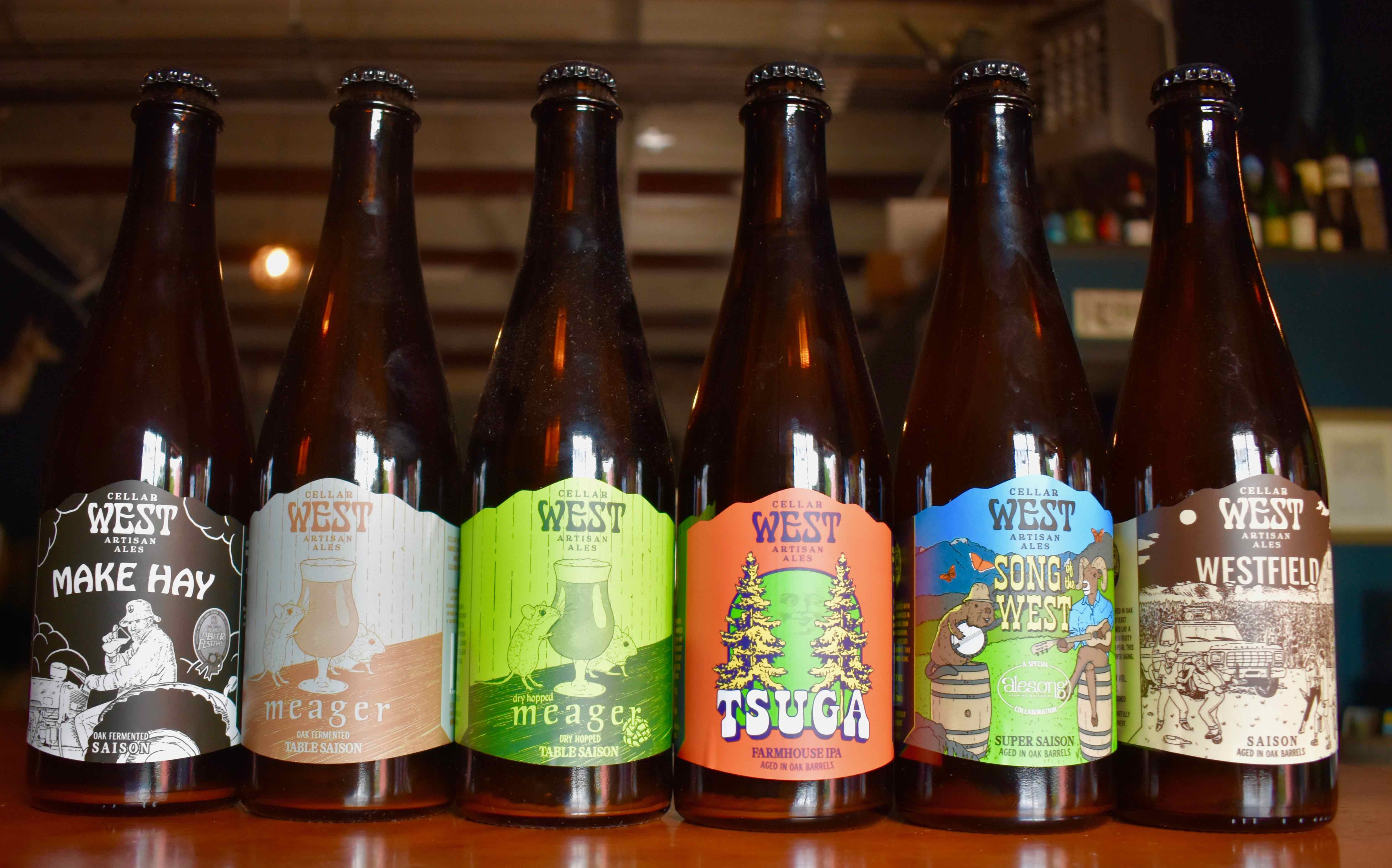
For Cellar West, the label is meant to be a visual representation of the artisanship of this small brewery specializing in oak-aged Brett beers. Everything at Cellar West is done by hand and it’s done by Zach Nichols – owner, brewer and label designer. To Nichols, the labels are an “extension of the beer and myself.”
This means that the labels aren’t based on a brand or a set of firm ideas. Instead, Nichols, who keeps a running list of potential beer names via a text message thread to himself lets it flow. There is no true order of what comes first the beer or the name. When it comes to the names Nichols shared that “ [they] come from things I hear on a daily basis, from somewhere, maybe a song lyric.” Often, he creates a new beer and then goes back to the thread to find something to match the style of the beer. For example, “if it’s a rustic saison it’s going to be something more classic and not super weird and funky.”
This process of matching the right style to the right name continues on for the label. When looking for inspiration Nichols often focuses on the idea of where he would like to be when drinking the particular beers. For example, for his beer, Meager, a super simple and delicate saison the label has mice drinking a beer on a basic wooden table with a classic saison glass. How does that make sense? When Nichols thinks of Farmhouse ales, he pictures farmhouses from the old country where mice scurry around in the barn.
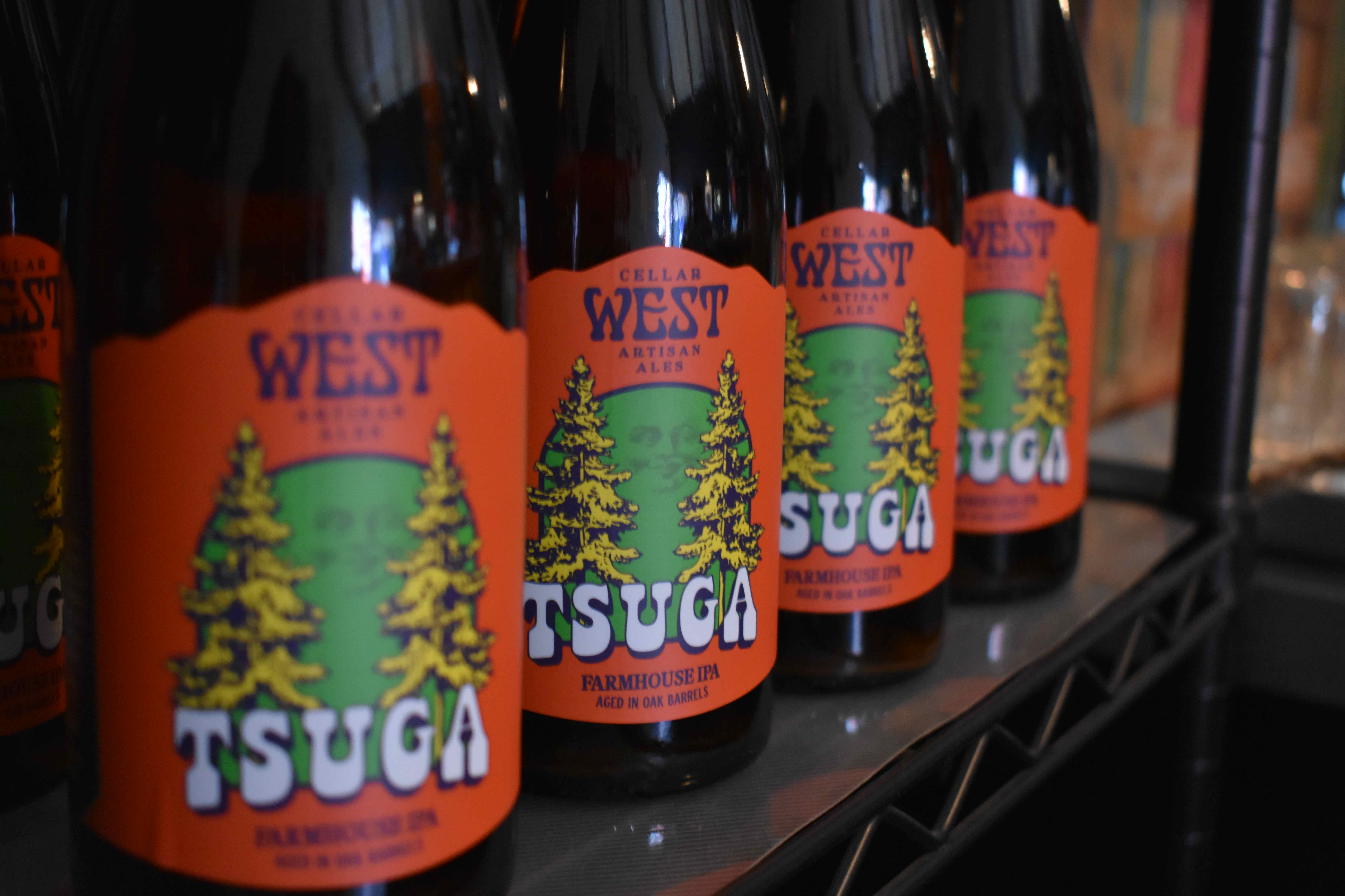
For most of the saisons Nichols says, “I try to keep the labels more simple and timeless. Keep it to maybe a couple of earth tone colors.” On the other side of the spectrum – let’s say he has brewed a triple dry hopped Brett IPA he goes “funky with the label.” Nichols wants to make sure that the energy and vibe of the label mimics the character of the beer.” By having the label reflect the beer you know what kind of beer you are getting into with Cellar West – classic saisons will be earth tones and simple while big hoppy and slightly tart beers will pop with bright colors and sometimes psychedelic designs.
When asked which labels were the easiest Nichols mentioned his original beer Westfield – the idea was a long time coming and it’s an old world take on a field party. At this party, however, they crush saisons instead of Natty Light. This is a throwback to his youth growing up in Wisconsin, where he might not have attended many but did enjoy a couple of field parties. The second easiest label also goes on the beer that brought Cellar West a GABF medal and that’s Make Hay, a robust saison. The idea of a jolly farmer crushing this beer on his tractor after a long day on the field came to Nichols right away.
Nichols also drew the three-eyed bird people see hanging outside the front down, currently in North Boulder but the brewery is on its way and expanding in a new location in Lafayette. Nichols wants people to know it’s a three-eyed loon and it represents the three cycles of fermentation each beer goes through before it ends up in our hands.
At Cellar West, the label is the beer – like most of the labels, it is that simple.
The Story of Fiction Beer
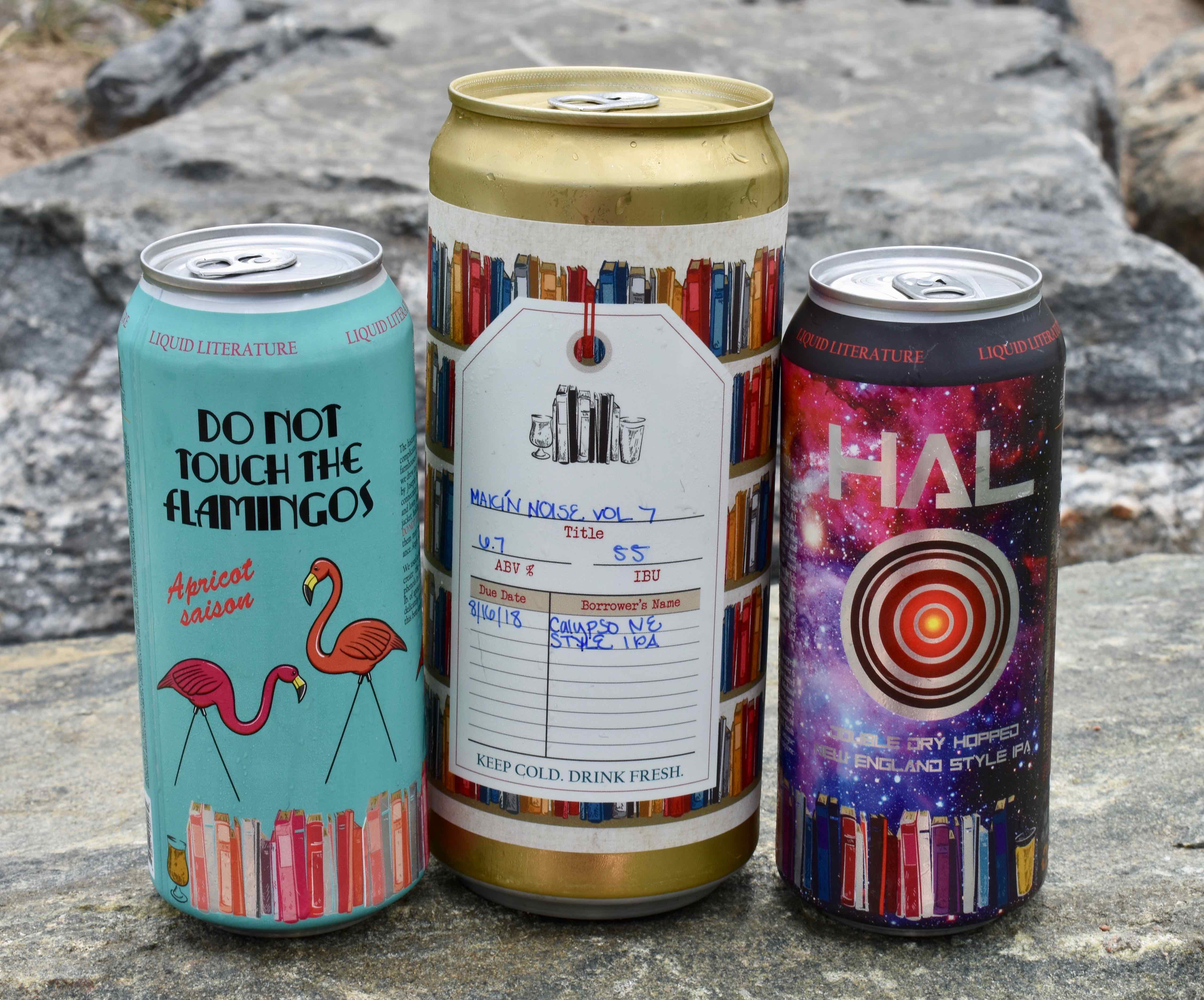
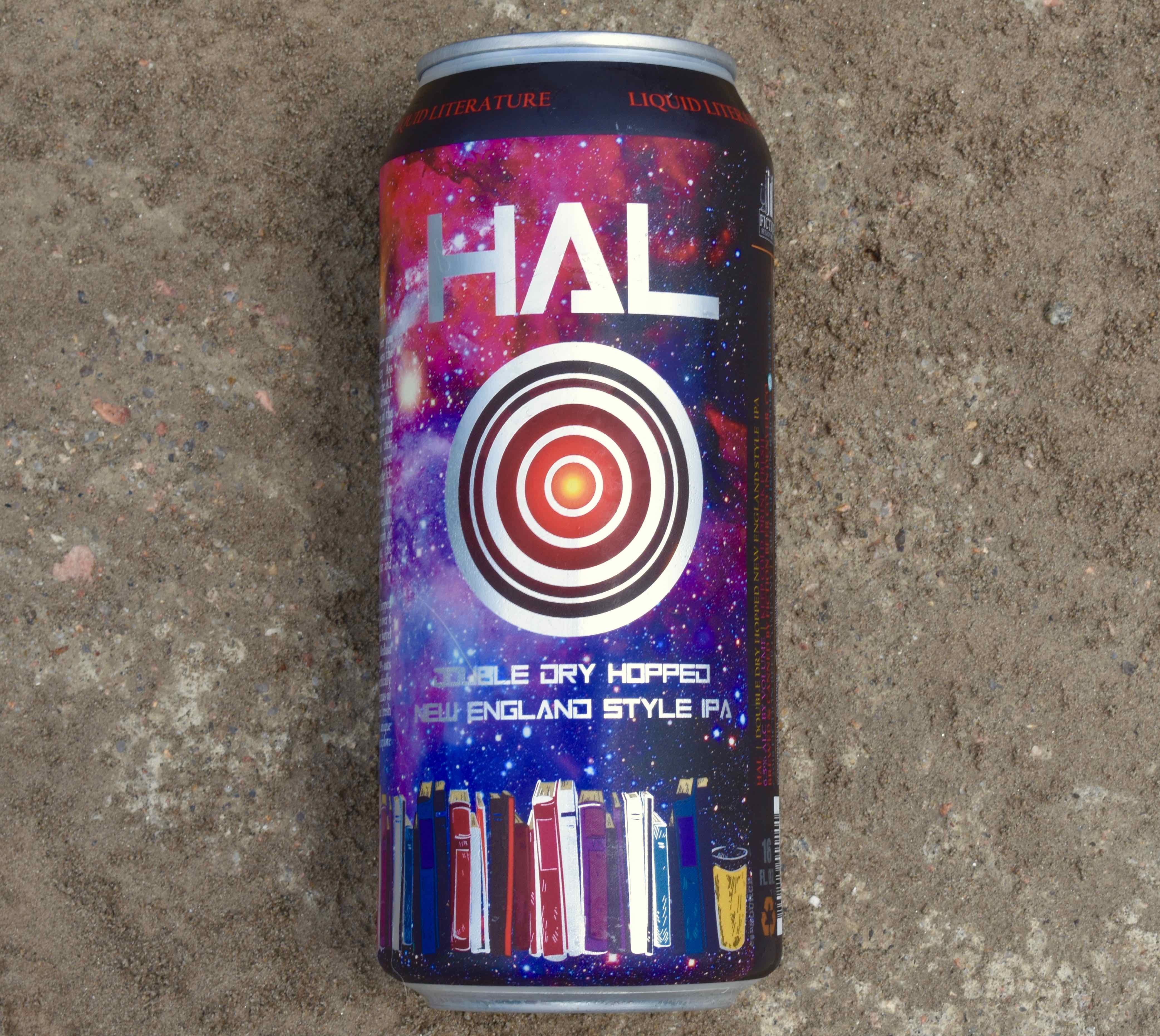
Fiction Beer Company has a firm identity — it’s all about books and beer. What you might not know is that people take this very, very seriously. When we sat down to talk with Christa Kilpatrick one of the co-owners and resident book nerd we found out just how serious. Kilpatrick shared people will or won’t drink one of our beers based on the book tied to it. Each beer brewed has a literary background.
Once a certain beer and book are paired, Kilpatrick then tells the story of how the beer, the style and its ingredients tie to that literary story on the back of each can except for the crowlers. All of this happens – the name, the backstory and the concept before the beer even gets to the graphic designer, Glissen Rhode.
After all of that plus the work that goes into the label imagine people basing their decision on whether to drink something solely based on the book. For example, with Madame Psychosis “some people absolutely loathed the book so they won’t drink the beer.” On the other hand, Fiction released, Never Tell Me The Hops, a Star Wars themed beer and according to Kilpatrick “people were just coming in because they wanted the label.” It just shows the passion people have for beer and literature which in the end is what Fiction Beer is about.
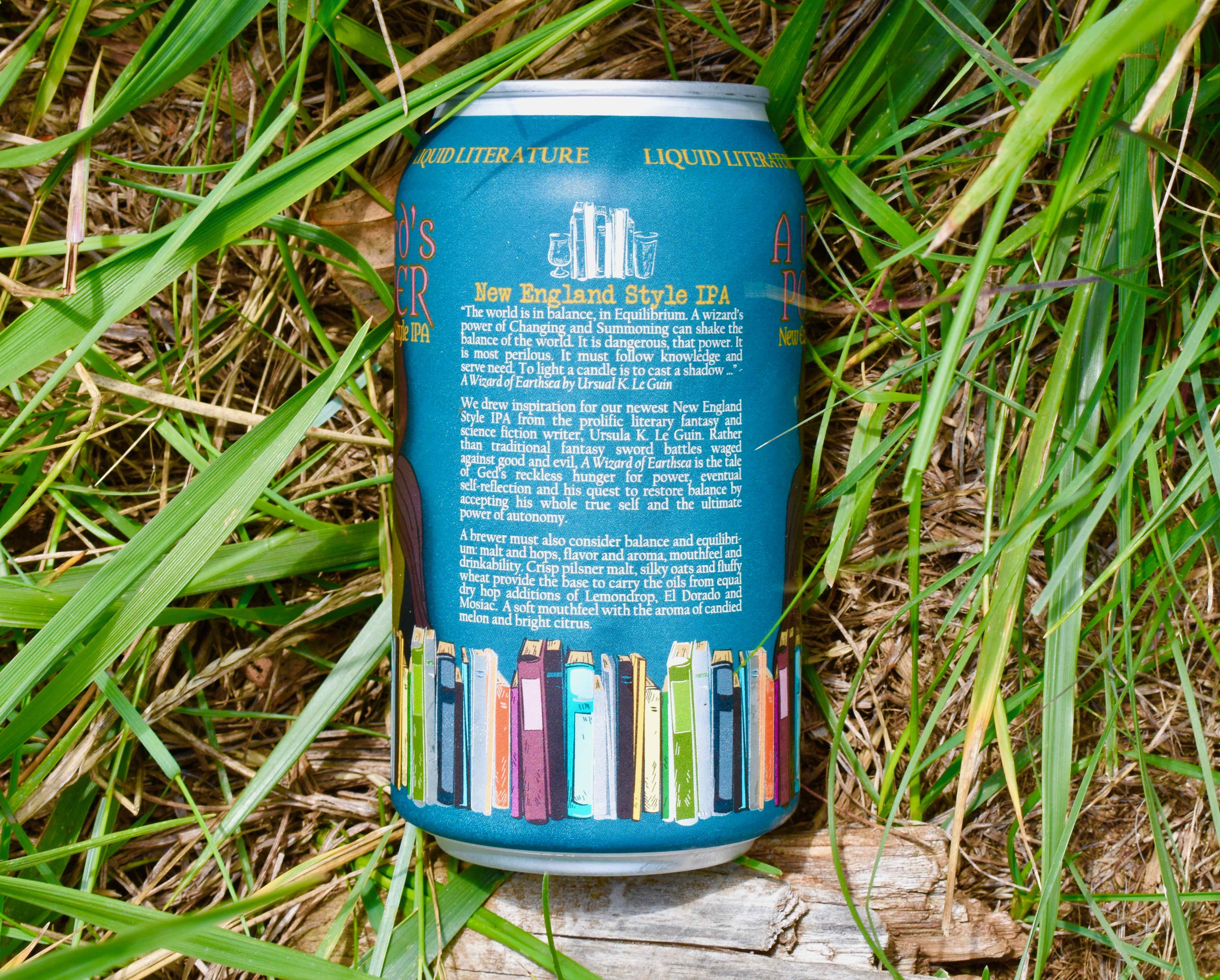
In talking with Rhode, her favorite part is that Fiction and Kilpatrick like to take risks and be bold whether it’s neon lettering or cutting through the color to let the can shine through. Glissen shares, “with their whole concept of books and beer it’s an opportunity to put artwork on the beer label why not make them resemble book covers?” In a sense, if you were to line up all of Fiction’s cans in a beer store it would be like walking into a bookstore. Yes, the publisher on each book is present, just like you will always find the row of books on Fiction’s cans but according to Rhode, “every beer is going to look different with a different kind of theme that pulls from the book and the beer style and the flavors.” When Kilpatrick and Rhode speak of the individual themes and ideas it’s easy to see why every can is different which is not something you see at most breweries.
Which labels does Rhode find the most difficult? According to Kilpatrick, “when we send sci-fi or wizards, she’s like hold up – it’s an adventure.” On the HAL can, for example, Kilpatrick and her husband (brewer Ryan Kilpatrick) were very specific about it needing to be HALS’ eye and that there be a nebula on the can that resembles a hop. On the other hand, when the Falconer was passed over to Rhode, “I gave her a bird and she was like I’ve got it.” Not only did she have it but Rhode sketched the bird of prey herself. The Falconer is not alone according to Rhode. “There is a spirit animal on each can, one element that represents the beer and the book. Logic is Relative is the Armadillo, Magic Wallet is Medusa.”
These descriptions, from as simple as a bird to extreme detail in the most challenging of labels which for Rhode was Beta Capsule (think sci-fi video game) are how she and Fiction collaborate. “Part of the creative process that I enjoy is taking their puzzle or riddle and teasing out what the creative direction will be.”
There is only one thing you can expect from the beers at Fiction and that is something different. Each beer and each can is going to tell you a story literally, via your taste buds and then bring it all together in the label.
“There is a spirit animal on each can, one element that represents the beer and the book. Logic is Relative is the Armadillo, Magic Wallet is Medusa.”
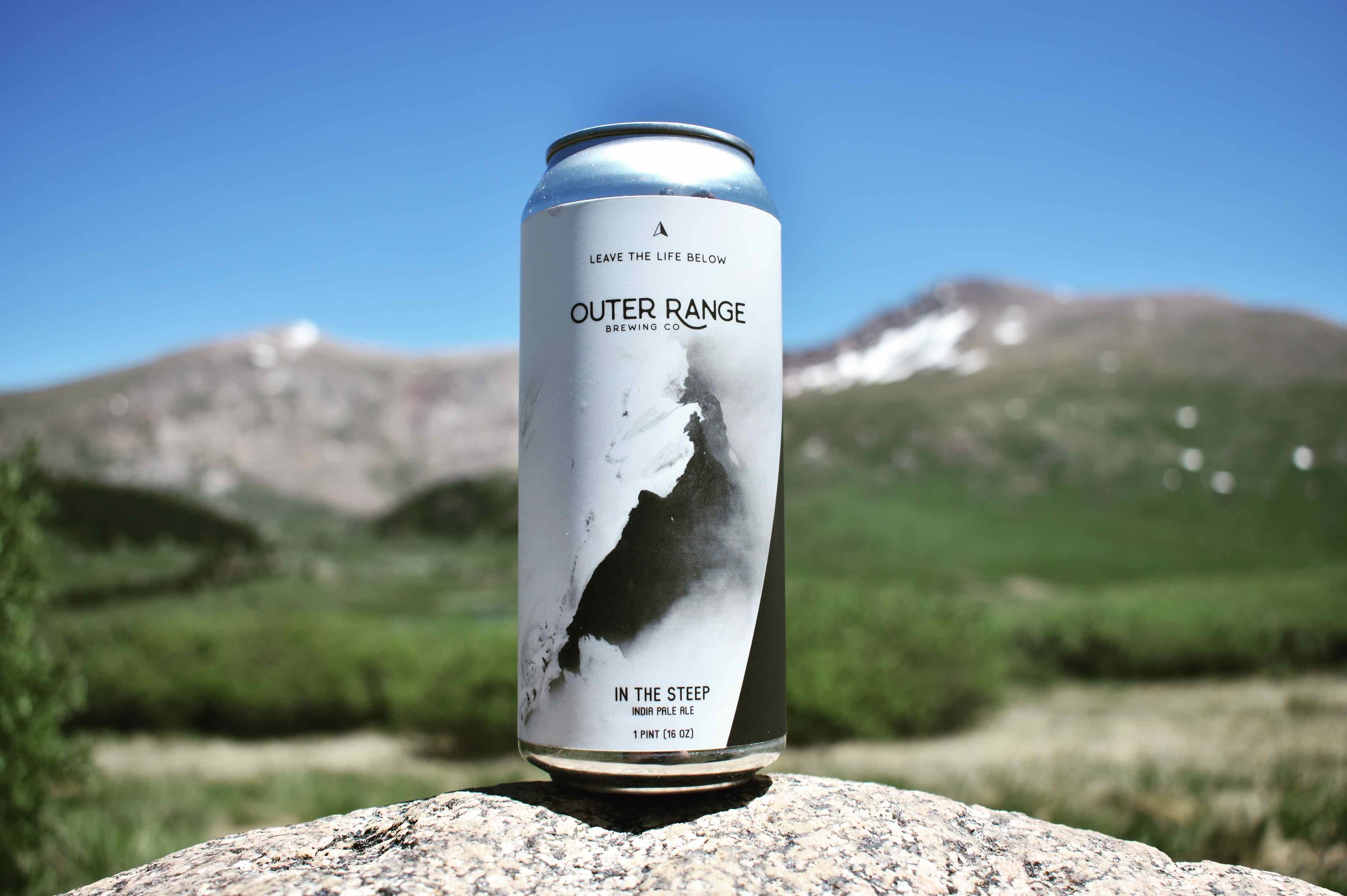
The Outer Range Lifestyle

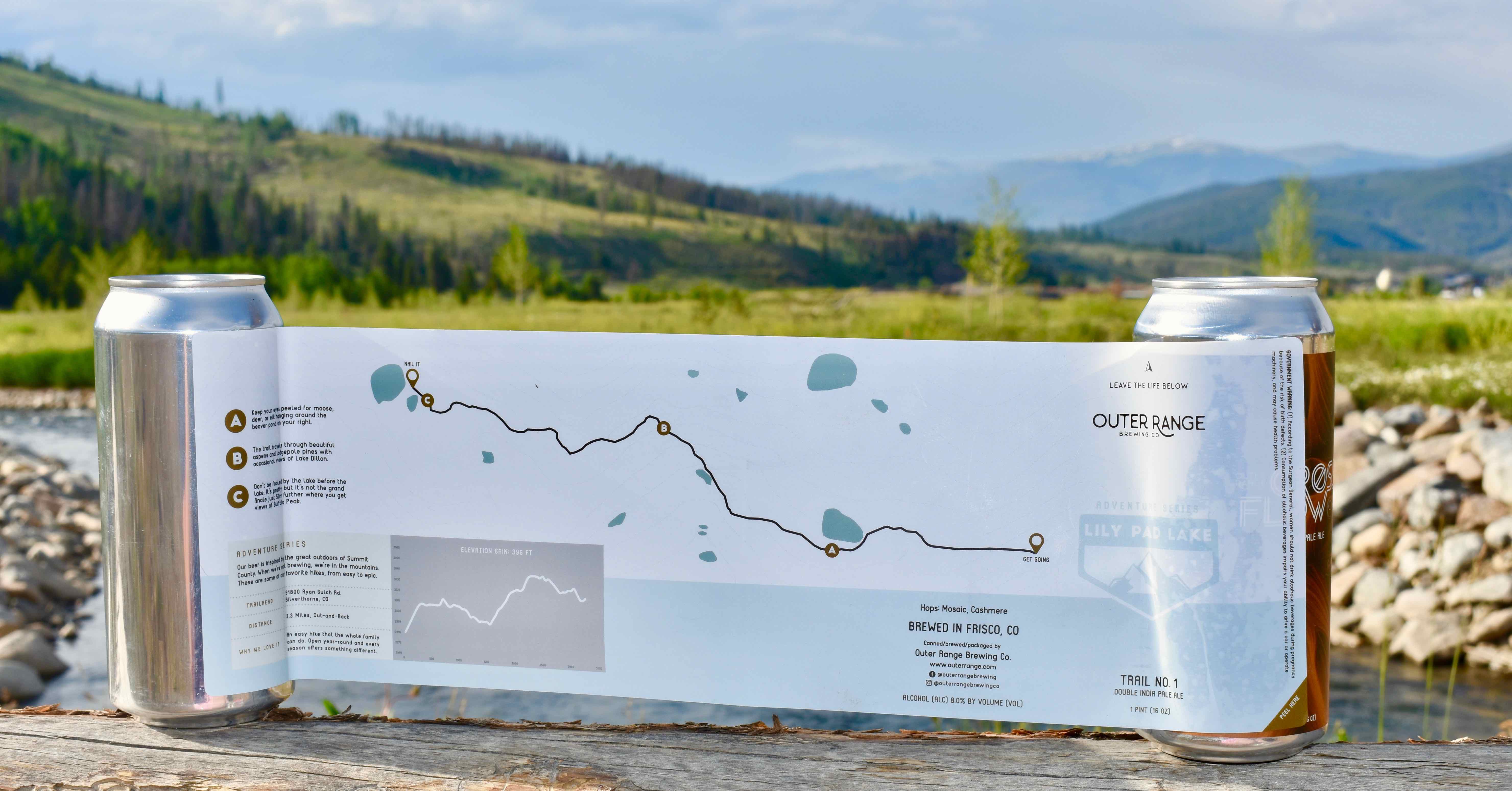
There is one thing Outer Range provides in the labels that grace its 16 ounces cans of Hazy IPAs or Belgian style beers and that is variety. The cans vary from pictures of Frisco from its earliest days to totally modern designs to the newest addition trail labels. There is one thing that goes across all of those labels however and that is a passion for the outdoors. The beer and particularly the trail labels are meant to transport you even if just for a moment away from everyday corporate life to the serenity of nature and mountains.
To understand why Outer Range is passionate about the mountains you need to know the backstory, we sat down with Emily Cleghorn who broke it down. Lee Cleghorn (co-owner and head brewer) and Emily (co-owner – branding and marketing) met when they were both stationed in Fort Carson in Colorado Springs while both enlisted in the Army. They got engaged in Keystone and married in Vail – the mountains have always played a role in their life and now their brewery. After they both finished serving they went to New York “to translate their Army skills into business acumen.” The entire time they were there Emily told us, “we yearned for this mountain lifestyle.”
Taking into account the Cleghorns’ personal backstory it’s not hard to see why they love Frisco and Summit County. Take for example the cans which focus on early Frisco. Outer Range partners with the Frisco Historic Museum for the photos that end up on the cans. To Emily “it’s important for a younger generation to understand our history here.” It speaks to the simplicity of the lifestyle that in a sense hasn’t changed over time.
Understanding the history helps with the Cleghorns’ goal, “to perpetuate love for the mountains” and of course craft beer. The Cabin Culture label which features an unmarried woman, wearing a long dress with a flower in her cap while as Emily puts it, “packing heat” still has a living relative in Frisco. While she was single when the photo was taken she was later married and via the historic museum, her great-nephew received a case of the beer featuring his great aunt.
“It’s not just about the beer, the beer is what we produce but we are trying to create experiences,” said Emily. This is where the Trail Labels come into play. All along Emily had wanted to share their local favorite trails with people coming up for the weekend – she even thought about passing about maps at a beer release when a friend asked her why not put them on a label? She thought to herself why not? She partnered with her graphic designer, Diana Griggs, as she does with all designs and a national topography agency to make sure the labels were useful. Each label also includes their favorite points of interest to make them fun.
At this time, there are five planned trails starting with Lily Pad Lake, a minimal elevation trail and will end with a 14er so people can do the trails in succession. Emily was searching for a way to give their beer fans a usable tool to explore the mountains and this was the right match. I would say it’s safe to say this won’t be going away after the initial five trails either. Here’s hoping the plans for something fun in the winter works out as well.
The Outer Range labels have a purpose to Emily, “the cans I feel like are something that can spread our message far and wide.” It helps of course that they are labeling damn good beers. Emilt makes it simple when it comes to who Outer Range is as a brewery, “we are trying to marry our love of craft beer with our love of the outdoors.”
—
Every brewery has a story and if you want to know it, you can find it on the label.
All Photography Alysia Shoemaker