


Full disclosure here: I’m not a big fan of London fashion week. I suppose that, much like at New York fashion week, most designers aren’t to my taste. I am not saying that they are bad at their jobs or anything, just that they do not hold much interest to me. That being said, there are a few London-presenting designers who I follow for a variety of reasons, so London fashion week does actually hold appeal for me (possibly more than NY actually). Anyway, this little roundup is late as it is, so here’s the very short rundown.
J.W. ANDERSON
J.W. Anderson, is in my opinion, one of the most interesting young designers to come out of London, or any city from that matter. Last season’s collection appeared, among other things, to be an exploration of line and form. This time around Anderson seems to focus on fabrics, and the interplay of different materials with the body. Of course, there is some experimentation here with form just like last season saw a few novel materials, but his focus seems to lay mostly in fabric itself instead of what can be added on top. The result was an impressive display of technique, creating garments that were both innovative and elegant.
What I liked:

The beautiful draping and contrast in this ensemble.

The texture and shine of this fabric.

I don’t know how he did this, but it looks exquisite.
What I disliked:
Nothing.
MARY KATRANTZOU
I admit that I have no idea why I follow Mary Katrantzou’s work as I’m not a fan of digital prints, and digital prints are all she ever does. Sometimes prints look good though, and this is clearly one of of those occasions. Katrantzou’s prints were of shoes this season, and while it may seem a bit odd, more often than not she incorporated them flawlessly with the form of the garments themselves. There were some looks that fell rather flat though, as they relied too heavily on print while neglecting structure.
What I liked:

The interesting pleats on this skirt.

How the print makes this dress appear more more complicated than it actually is.

That this dress looks like it came from the future.
What I didn’t like:

That this dress is just a vehicle for a print.

The printed legging / shirt combination wore out its welcome a long time ago.

This is a seizure waiting to happen.
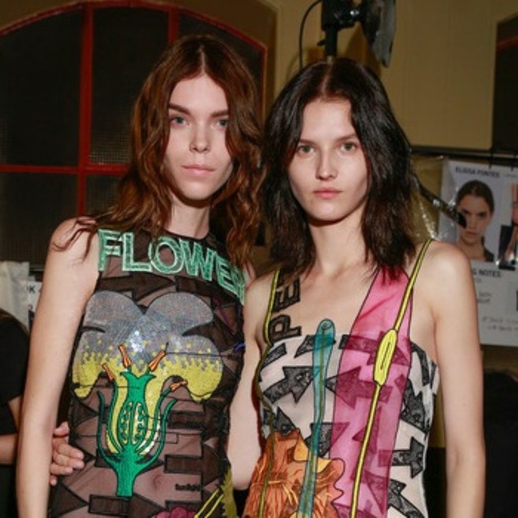
CHRISTOPHER KANE
Another interesting young designer, Christopher Kane’s work is work keeping an eye on if you don’t already. Kane focused on flowers for this Spring, which I would normally loathe, but this is Christopher Kane we’re talking about. He’s not about to create something that obvious. What resulted was a collection that explored different aspects of flowers and plants; their anatomy, form, and role in the environment while simultaneously comparing them with women. While it sounds a bit cerebellar, it didn’t quite seem that way as Kane mixed this concept with his usual sense of whimsy. I did enjoy most of the collection, but I found some looks to be less than stellar. That’s just what happens when you cover so much ground, it seems.
What I liked:

How these petal cutouts create a collar.

This semi-reflective, fuzzy fabric.

The draping and details that make this potentially boring beige dress anything but.

That Christopher Kane found a way to make Spring florals interesting.
What I didn’t like:

A lot of these petal cut out pieces showed up, and some were clearly better than others.

That this sweatshirt (as well as its knockoffs and imitations) are going to be all over lookbook.nu I can feel it.
TOM FORD
I’ve been a longtime fan of Mr.Ford and I’m at the point where I will still unabashedly enjoy his collections despite knowing they are not as flaw-free as I wish they were. In general, I like most of what he puts out, I’m obsessed with his makeup and fragrance line (if you see a Tom Ford fragrance display I will probably be there, huffing), and I’m eternally a fan of his work for Gucci so I’m especially happy when a collection turns out to be amazing. This collection was exactly that, and a vast improvement over last season’s. There was very little not to like, and the collection was classic Tom Ford: luxurious, decadent, and overall glamorous.
What I liked:

This exquisite coat.

That when Tom Ford does fur, he tends to knock it out of the park.

This is astonishing.
What I didn’t like:

I feel like this looked better on paper.
MEADHAM KIRCHHOFF
Kirchhoff’s doll-like aesthetic is very hit and miss for me. Some seasons I love, others not so much. This was the former, as the kitchy goth feel of the collection was both light and airy for spring, yet had enough long hems, black, and coats for me to like it. Since they started to plant their somewhat infantile dress-up feel a few seasons back, the brand hasn’t been too focused on simplicity. Despite that, a few looks came out a bit too overdone.
What I liked:

The combination of textures and fabrics in this ensemble.

This is reminiscent of Comme des Garçons f/w 2008, therefore I’m into it.

This mix of inner and outerwear.
Anyway, this is already late so I hope you read through it quickly because Milan is over and Paris is going on right now. Stay tuned.