


The long-standing uniform in fashion has been black on black on black. It’s chic and timeless and conveys serious style. But let’s be honest, anyone can match black with black, but only a well-practiced fashionista (or fashionisto) can match an ikat print with a floral without looking too busy. Learn how to mix prints with the best of them with these easy steps.
How to mix spring prints for a fashionable look
Level One:

Start with one piece of clothing that’s in a dramatic print: think floral, ikat or plaid. Pick out one color from the print, but instead of choosing a solid-colored piece, pair it with a piece of clothing that draws on that color.
For now, keep the secondary print relatively simple, such as polka dots or stripes. For example, we paired a busy floral with stripes in a light pink that can be found in the middle of the flower.
Level Two:
Once you feel comfortable with Level One mixing, you can try mixing two dramatic prints. The key is in pairing colors.
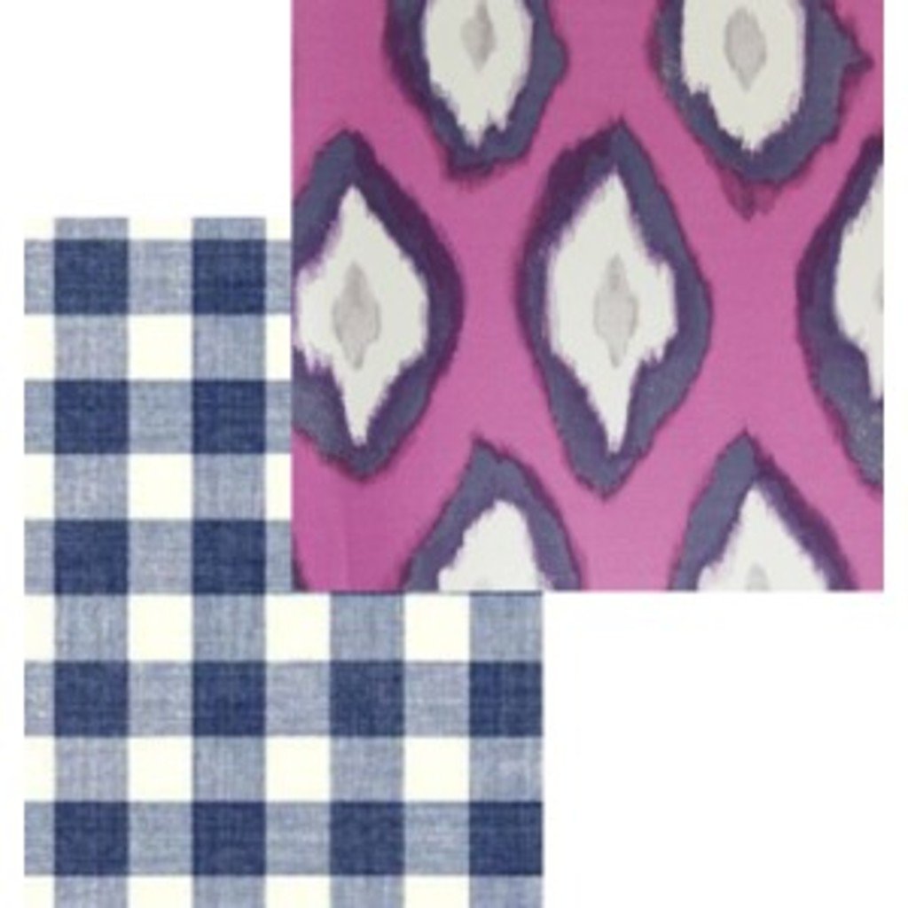
A mutual color can fashionably combine two very different prints. We used the navy color to tie together a gingham print with this bright ikat.
Level Three
Once you can effectively pair two separate prints, you can officially venture into expert territory by adding in a third. Avoid another dramatic print, as this can quickly become far too busy and displeasing.
Instead, think back to the more simple and neutral prints that we introduced in Level One. Stripes, polka dots and even certain leopard prints can work as neutral.
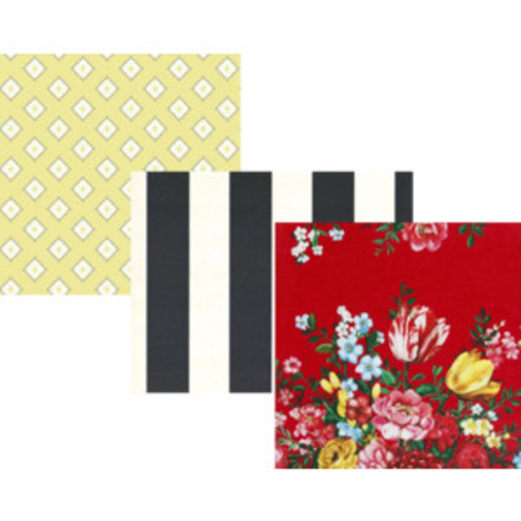
We started off with a bright floral, paired it with an ikat by working with the yellow in both, and then finished off by adding in a neutral stripe.
Remember, nothing says experienced fashion lover quite like being able to mix several different prints. So put down the black and pick up the patterns and switch out your chic outfit for an interesting one.